Exploratory data analysis (EDA) is an informal, iterative process in which we generate questions about our data and explore them using statistical summaries and data visualization methods.
The goal is to better understand the data, investigate ideas, identify challenges, and refine or generate new questions.
Exploratory data analysis gives useful insights for data cleaning, data transformation, and model building.
The diamonds data set
The diamonds data set from ggplot2 contains the prices and other attributes of almost about 54,000 diamonds. This data set has 10 variables:
price - Price in US dollars: 326 to 18,823
carat - Weight of the diamond: 0.2 to 5.01
cut - Quality of the cut: Fair, Good, Very Good, Premium, Ideal
color - Diamond color: J (worst) to D (best)
clarity - How clear the diamond is: I1 (worst), SI2, SI1, VS2, VS1, VVS2, VVS1, IF (best)
x - Length in mm: 0 to 10.74
y - Width in mm: 0 to 58.9
z - Depth in mm: 0 to 31.8
depth - Total depth percentage: 43 to 79
table - Width of top relative to widest point: 43 to 95
library(ggplot2)diamonds
# A tibble: 53,940 × 10
   carat cut       color clarity depth table price     x     y     z
   <dbl> <ord>     <ord> <ord>   <dbl> <dbl> <int> <dbl> <dbl> <dbl>
 1  0.23 Ideal     E     SI2      61.5    55   326  3.95  3.98  2.43
 2  0.21 Premium   E     SI1      59.8    61   326  3.89  3.84  2.31
 3  0.23 Good      E     VS1      56.9    65   327  4.05  4.07  2.31
 4  0.29 Premium   I     VS2      62.4    58   334  4.2   4.23  2.63
 5  0.31 Good      J     SI2      63.3    58   335  4.34  4.35  2.75
 6  0.24 Very Good J     VVS2     62.8    57   336  3.94  3.96  2.48
 7  0.24 Very Good I     VVS1     62.3    57   336  3.95  3.98  2.47
 8  0.26 Very Good H     SI1      61.9    55   337  4.07  4.11  2.53
 9  0.22 Fair      E     VS2      65.1    61   337  3.87  3.78  2.49
10  0.23 Very Good H     VS1      59.4    61   338  4     4.05  2.39
# ℹ 53,930 more rows
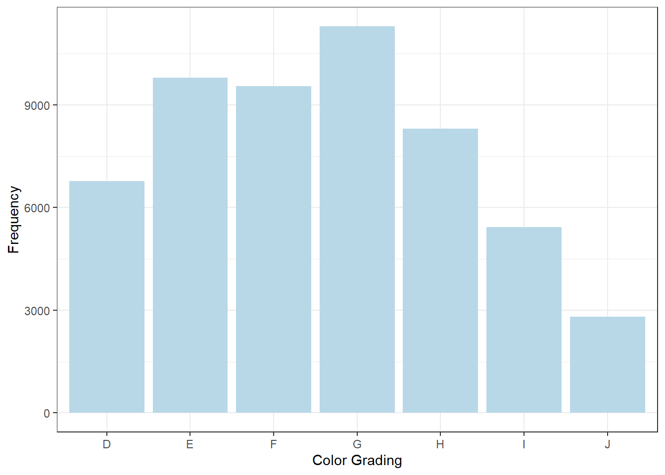
The color grading of diamonds is given as follows:
From Dr. Çetinkaya-Rundel
The clarity grading of diamonds is given as follows:
From Dr. Çetinkaya-Rundel
x, y, z, depth, and table are measured as follows:
From Dr. Çetinkaya-Rundel
Exploring diamonds with ggplot2
💻 Hands-On
What type of variable is cut? How many diamonds are in each cut category? Which cut category is most/least common?
Answer
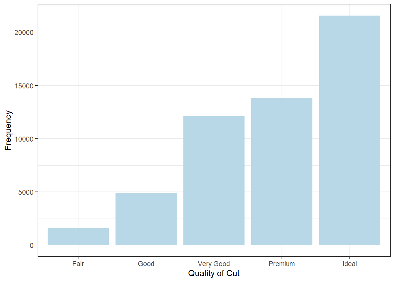
cut is a categorical variable. Looking at the frequency distribution of cut, we see that Fair is the least common, while Ideal is the most common. To visualize the frequency distribution, we can use a bar plot.
table(diamonds$cut)
     Fair      Good Very Good   Premium     Ideal
     1610      4906     12082     13791     21551
Explore the distribution of clarity using appropriate visualizations.
Answer
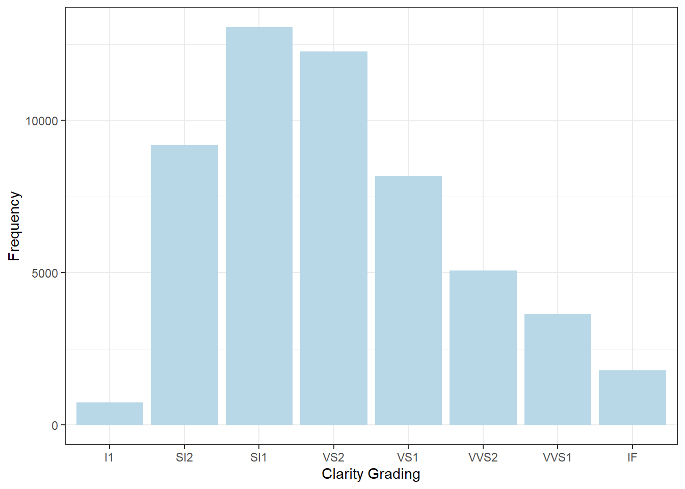
clarity is a categorical variable, we can also use a bar plot to visualize its frequency distribution. Most common clarity ratings are SI2, SI1, and VS2, which contain some “dirt” in the diamonds.
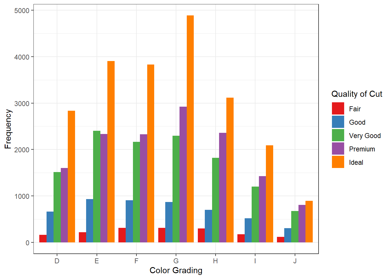
Recall that both cut and color are both categorical variables. To explore their relationship, we can use side-by-side bar plots. From the plot, the frequency distribution of the quality of cut is similar across all color gradings. Within any color, Ideal cut is still most common, while Fair cut is least common.
ggplot(diamonds, mapping =aes(x = color, fill = cut)) +geom_bar(position ='dodge') +theme_bw() +scale_fill_brewer(palette ='Set1') +labs(x ='Color Grading',y ='Frequency',fill ='Quality of Cut')
💻 Hands-On
What type of variable is price? What is the distribution of diamond prices? Are they symmetric or skewed? Does the shape of the distribution surprise us?
Answer
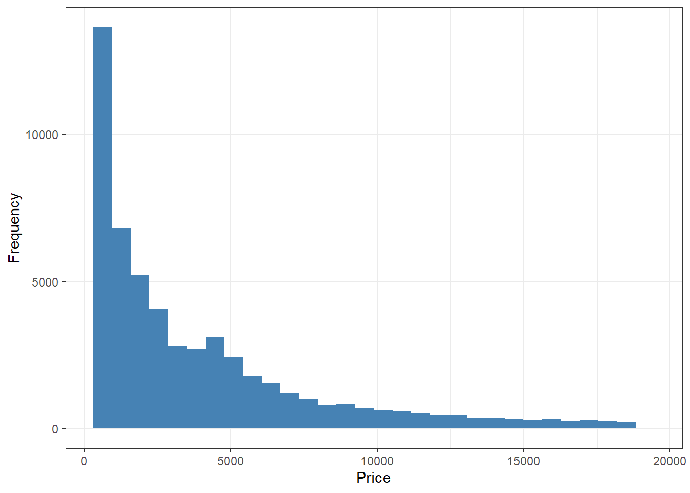
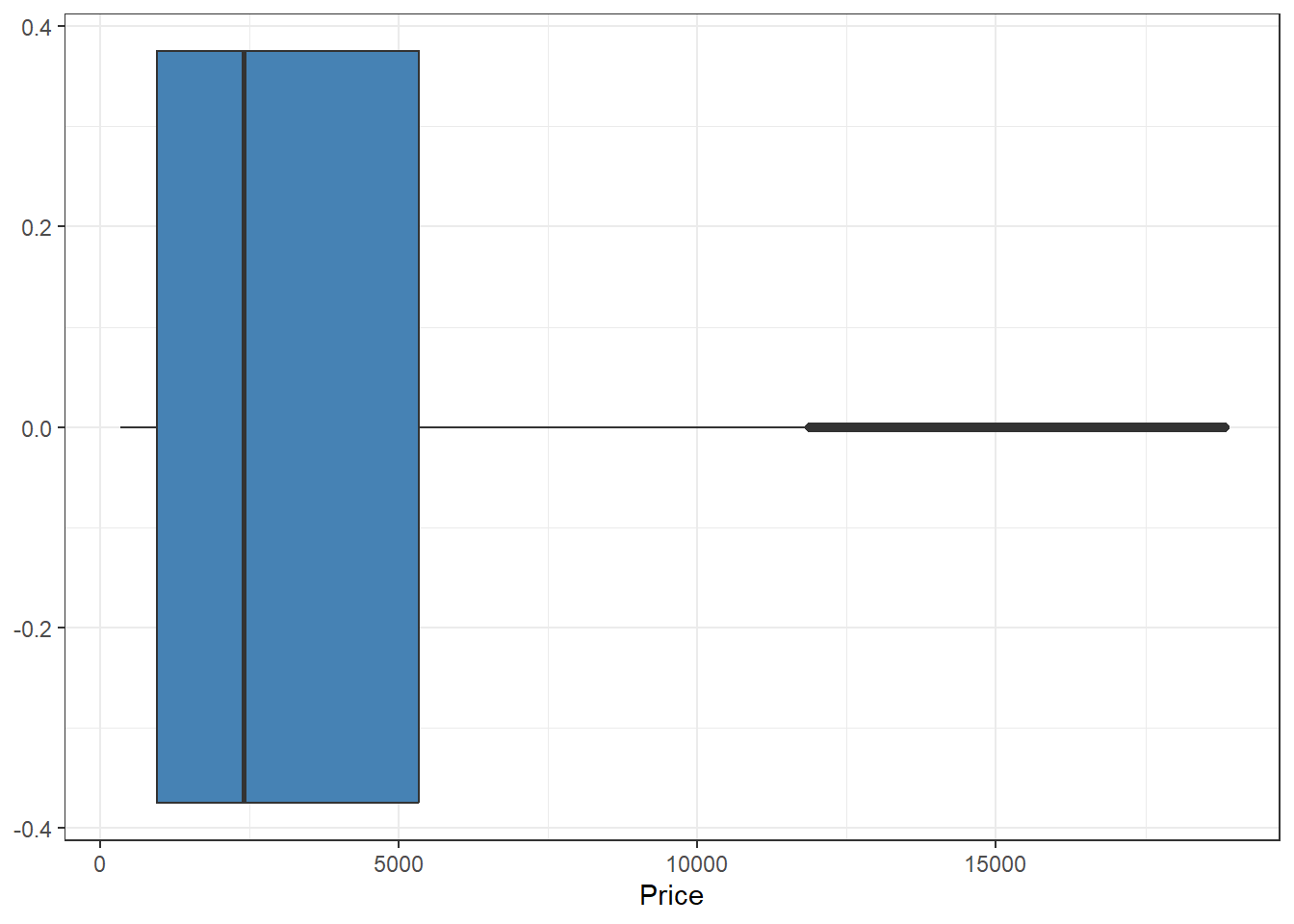
price is a numerical variable. Looking at its histogram, we can see that the distribution is right-skewed, meaning lower-priced diamonds are more common. This is perhaps not very surprising, because we do expect some diamonds to be extremely expensive. Since the distribution is right-skewed, the median price is a better representative value compared to the mean.
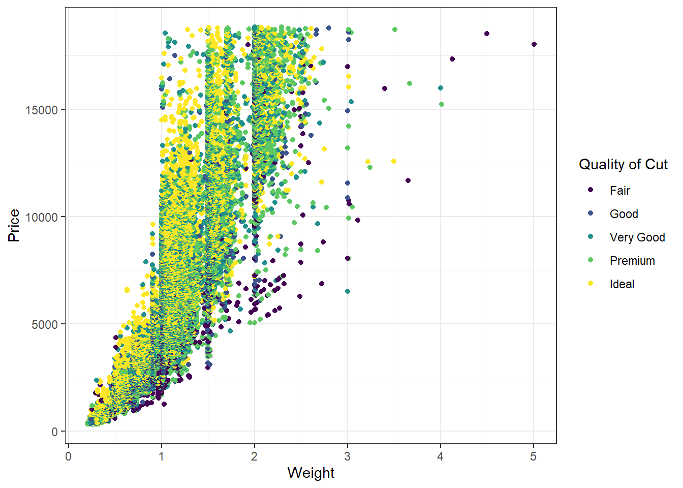
Intuitively, diamonds with heavier carat weights are more expensive. Is that necessarily the case in this data set? Explore the relationship between price and carat? How does another variable, such as cut and color, affect this relationship?
Answer
The scatter plot of carat and price confirms our intuition that heavier diamonds are more expensive.
ggplot(diamonds, mapping =aes(x = carat, y = price, color = cut)) +geom_point() +theme_bw() +labs(x ='Weight',y ='Price',color ='Quality of Cut')