install.packages("tidyverse")5A: Data Visualization with ggplot2
Readings
From R for Data Science by Drs. Hadley Wickham, Garrett Grolemund, and Mine Çetinkaya-Rundel:
From ggplot2: Elegant Graphics for Data Analysis (3e) by Dr. Hadley Wickham:
Also check out Data Tidying from Data Science with R by Dr. Garrett Grolemund for more in-depth explanation of tidy data.
Topics
The
tidyverseTidy data
Tibble
ggplot2and the grammar of graphicsData visualization with
ggplot2
The tidyverse

The
tidyversepackage is a collection of packages for data science developed by Hadley Wickham and his team at Posit:ggplot2for data visualizationdplyrfor data manipulationtidyrfor getting data in “tidy” formattibblefor enhancing data framesreadrfor importing rectangular data (like csv, tsv, and fwf)havenfor importing and exporting SPSS, Stata and SAS filespurrrfor functional programmingstringrfor working with stringsforcatsfor handling categorical datalubridatefor working with date-times
We can install
tidyverseas follows
- To use
tidyverse, we need to load it as follows
library(tidyverse)- We may encounter some variation of following message and that is okay
# ── Attaching core tidyverse packages ─────────────────────── tidyverse 2.0.0 ──
# ✔ dplyr     1.1.4     ✔ readr     2.1.5
# ✔ forcats   1.0.0     ✔ stringr   1.5.1
# ✔ ggplot2   4.0.0     ✔ tibble    3.2.1
# ✔ lubridate 1.9.4     ✔ tidyr     1.3.1
# ✔ purrr     1.0.2
# ── Conflicts ───────────────────────────────────────── tidyverse_conflicts() ──
# ✖ tidyr::expand() masks Matrix::expand()
# ✖ dplyr::filter() masks stats::filter()
# ✖ dplyr::lag()    masks stats::lag()
# ✖ tidyr::pack()   masks Matrix::pack()
# ✖ dplyr::select() masks MASS::select()
# ✖ tidyr::unpack() masks Matrix::unpack()
# ℹ Use the conflicted package to force all conflicts to become errors
Tidy data
Tabular data are often organized in a wide format or a long format.
The wide format typically uses more columns and requires less repetition.

- On the other hand, the long format tends to be less compacted with more rows.

- Tabular data is tidy if each variable forms a column, each observation forms a row, and each cell is a single measurement. Tidy data is often in a long format.

tidyversebelieves that tidy data in a long format is ideal for doing data science with R, because it is easier to extract every value of a variable to build a plot or to compute a summary statistic.
💻 Hands-On
The heights in centimeters and weights in kilograms of Amy and Ben are measured at ages 11, 14, and 18. The data are organized in a long format and a wide format. If we want to convert heights to inches and weights to pounds, which format is easier to work with?
long_df <- data.frame(
  name   = c('Amy', 'Amy', 'Amy', 'Ben', 'Ben', 'Ben'),
  age    = c(11, 14, 18, 11, 14, 18),
  height = c(144, 160, 167, 146, 158, 165),
  weight = c(36, 50, 58, 38, 48,55)
)

wide_df <- data.frame(
  name   = c('Amy', 'Ben'),
  height_11 = c(144, 146),
  height_14 = c(160, 158),
  height_18 = c(167, 165),
  weight_11 = c(36, 38),
  weight_14 = c(50, 58),
  weight_18 = c(58, 55)
)
Answer
Extracting, transforming, and modifying variables can be easier with the long format compared to the wide format.
# With long format
long_df$height

# With wide format
wide_df[, c('height_11', 'height_14', 'height_18')]
Tibble
A tibble is an enhanced version of base R data frame developed in
tidyverse.One noticeable difference is that a tibble has better printing capabilities.
For a comprehensive list of Differences between tibbles vs data.frames, check out the video of Dr. Johsua French.
💻 Hands-On
Try the following code and describe the difference between a traditional data frame and a tibble.
# Loan data
loan <- read.csv(url('https://raw.githubusercontent.com/hungtong/DS-01-101/refs/heads/main/dataset/loan50.csv'))

# Traditional data frame
loan

# Tibble
as_tibble(loan)
Answer
Since loan has 50 observations and 18 variables, printing loan as a data frame will take a lot of space in the console. Tibble presents the data more compactly and descriptively.
# # A tibble: 50 × 18
#    state emp_length  term homeownership annual_income verified_income
#    <chr>      <int> <int> <chr>                 <int> <chr>
#  1 NJ             3    60 rent                  59000 Not Verified
#  2 CA            10    36 rent                  60000 Not Verified
#  3 SC            NA    36 mortgage              75000 Verified
#  4 CA             0    36 rent                  75000 Not Verified
#  5 OH             4    60 mortgage             254000 Not Verified
#  6 IN             6    36 mortgage              67000 Source Verified
#  7 NY             2    36 rent                  28800 Source Verified
#  8 MO            10    36 mortgage              80000 Not Verified
#  9 FL             6    60 rent                  34000 Not Verified
# 10 FL             3    60 mortgage              80000 Source Verified
# # ℹ 40 more rows
# # ℹ 12 more variables: debt_to_income <dbl>, total_credit_limit <int>,
# #   total_credit_utilized <int>, num_cc_carrying_balance <int>,
# #   loan_purpose <chr>, loan_amount <int>, grade <chr>, interest_rate <dbl>,
# #   public_record_bankrupt <int>, loan_status <chr>, has_second_income <lgl>,
# #   total_income <int>
# # ℹ Use `print(n = ...)` to see more rows
Fuel economy data mpg
For this lesson, we will work with the data set
mpgfromggplot2.mpgcontains information about the fuel economy of popular car models between 1999 and 2008 collected by the Environmental Protection Agency (EPA). The data set is a subset from https://fueleconomy.gov/.
library(ggplot2)

mpg
# A tibble: 234 × 11
manufacturer model displ year cyl trans drv cty hwy fl class
<chr> <chr> <dbl> <int> <int> <chr> <chr> <int> <int> <chr> <chr>
1 audi a4 1.8 1999 4 auto… f 18 29 p comp…
2 audi a4 1.8 1999 4 manu… f 21 29 p comp…
3 audi a4 2 2008 4 manu… f 20 31 p comp…
4 audi a4 2 2008 4 auto… f 21 30 p comp…
5 audi a4 2.8 1999 6 auto… f 16 26 p comp…
6 audi a4 2.8 1999 6 manu… f 18 26 p comp…
7 audi a4 3.1 2008 6 auto… f 18 27 p comp…
8 audi a4 quattro 1.8 1999 4 manu… 4 18 26 p comp…
9 audi a4 quattro 1.8 1999 4 auto… 4 16 25 p comp…
10 audi a4 quattro 2 2008 4 manu… 4 20 28 p comp…
# ℹ 224 more rows- The data set contains the following categorical variables:
manufacturernamemodelnameyearof manufacturetrans- type of transmissiondrv- type of drive train, front-wheelf, rear-wheelr, or four-wheel4fl- fuel typeclass- type of car

- The data set contains the following numerical variables:
displ- engine displacement (size), in litrescyl- number of cylinderscty- miles per gallon for city drivinghwy- miles per gallon for highway driving

- For this lesson, we are interested in the relationship of engine size and fuel economy. Note that engine size can be indicated by
displ.
💻 Hands-On
Try the following code and describe the difference between str() and glimpse(). Note that str() is from base R and glimpse() is from the tidyverse.
# Base R
str(mpg)

# Tidyverse
glimpse(mpg)
Answer
glimpse() is similar to str() but seems to be formatted better.
# Rows: 234
# Columns: 11
# $ manufacturer <chr> "audi", "audi", "audi", "audi", "audi", "audi", "audi", "aud…
# $ model        <chr> "a4", "a4", "a4", "a4", "a4", "a4", "a4", "a4 quattro", "a4 …
# $ displ        <dbl> 1.8, 1.8, 2.0, 2.0, 2.8, 2.8, 3.1, 1.8, 1.8, 2.0, 2.0, 2.8, …
# $ year         <int> 1999, 1999, 2008, 2008, 1999, 1999, 2008, 1999, 1999, 2008, …
# $ cyl          <int> 4, 4, 4, 4, 6, 6, 6, 4, 4, 4, 4, 6, 6, 6, 6, 6, 6, 8, 8, 8, …
# $ trans        <chr> "auto(l5)", "manual(m5)", "manual(m6)", "auto(av)", "auto(l5…
# $ drv          <chr> "f", "f", "f", "f", "f", "f", "f", "4", "4", "4", "4", "4", …
# $ cty          <int> 18, 21, 20, 21, 16, 18, 18, 18, 16, 20, 19, 15, 17, 17, 15, …
# $ hwy          <int> 29, 29, 31, 30, 26, 26, 27, 26, 25, 28, 27, 25, 25, 25, 25, …
# $ fl           <chr> "p", "p", "p", "p", "p", "p", "p", "p", "p", "p", "p", "p", …
# $ class        <chr> "compact", "compact", "compact", "compact", "compact", "comp…
ggplot2 and the grammar of graphic
ggplot2is an R package for data visualization which implements the grammar of graphics introduced by Leland Wilkinson.While base R graphics we have seen are generally fast,
ggplot2is versatile and widely used for making elegant and beautiful graphics.ggplot2is good for visualizing the relationship between multiple variables.The grammar of graphic of Leland Wilkinson defines a statistical graph based on the following layers (components):

ggplot2builds a plot by adding multiple layers, each of which has a specific role. At the most basic level, aggplot2consist of:- The data set to visualize
- Aesthetics that map variables to visual properties
- Geometry to represent the observations
Common aesthetics include:
xfor the x-axisyfor the y-axisfillfor interior color (bars, areas, polygons, etc.)colorfor line or point colorsizefor the size of the observationalphafor adjusting transparencyshapefor the shape of the observation
Common geometries include:
geom_pointfor scatter plotgeom_barfor bar plotgeom_linefor line plotgeom_smoothfor smoothing linegeom_histogramfor histogramgeom_densityfor density curvegeom_boxplotfor box plotgeom_violinfor violin plot
Facets divide data into groups and display multiple plots to compare them.
Statistics provide summaries and transformations.
Coordinates control the position of data points: Cartesian, fixed-aspect ratio, or polar coordiate.
Theme controls the appearance of the plot and annotations.
The R Graph Gallery provides a collection of graphs made with base R and
ggplot2.
Scatter plot geom_point()
- The first layer of the plot is the data set to visualize.
ggplot(mpg)
- The second layer is the mapping of aesthetics.
ggplot(mpg, mapping = aes(x = displ, y = hwy))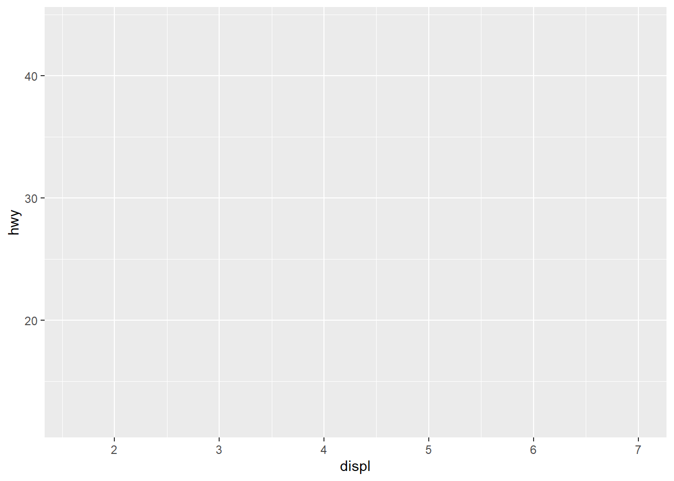
- The third layer indicates which geometry to represent the observations.
ggplot(mpg, mapping = aes(x = displ, y = hwy)) +
  geom_point()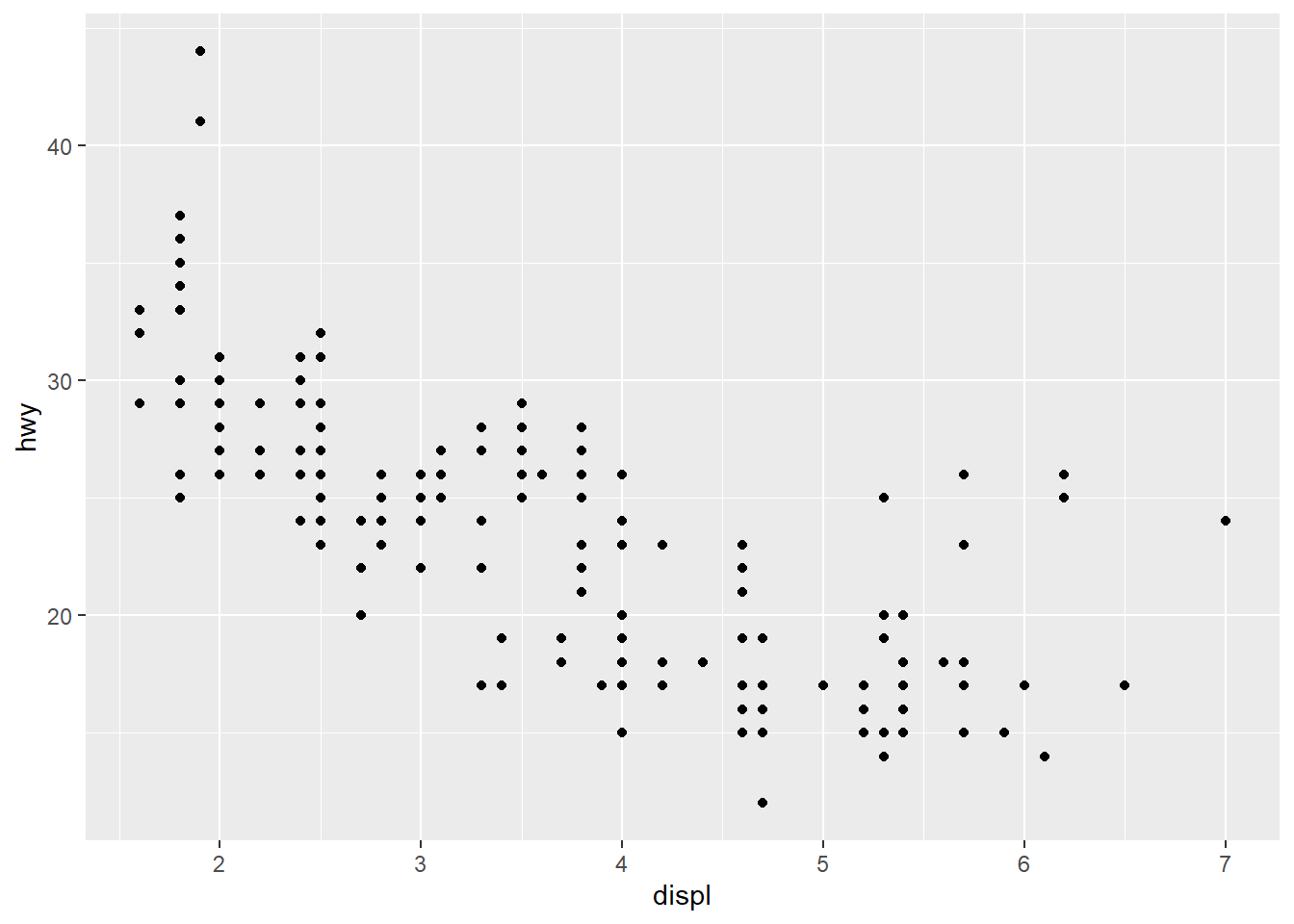
- Color, size, and transparency can be adjusted
ggplot(mpg, mapping = aes(x = displ, y = hwy)) +
  geom_point(color = 'steelblue', size = 3, alpha = 0.7)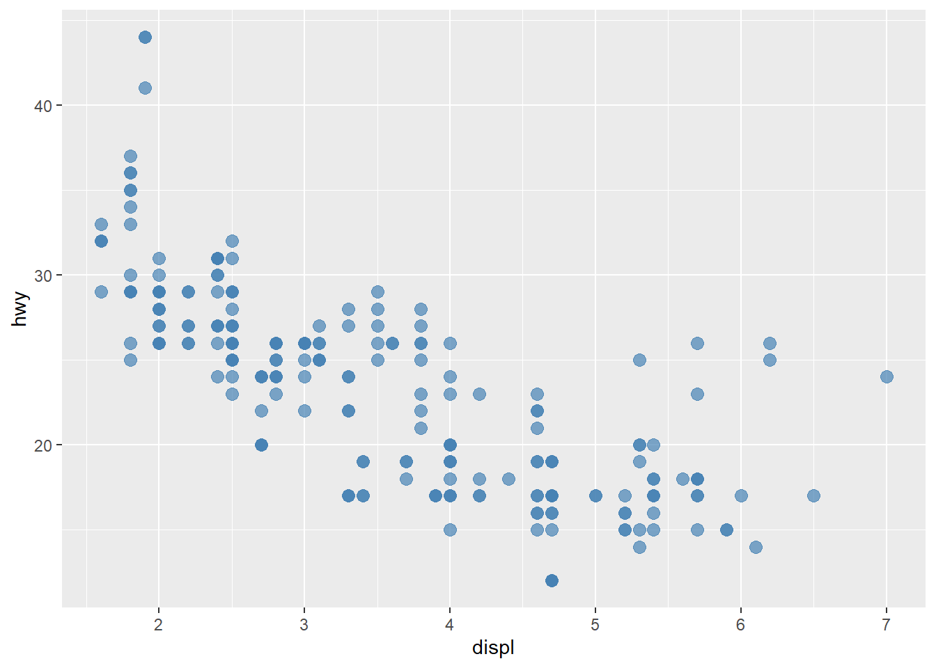
- For scatter plots, adding a smoothing line with
geom_smooth()can help us see the trend.
ggplot(mpg, mapping = aes(x = displ, y = hwy)) +
  geom_point(color = 'steelblue') +
  geom_smooth()
`geom_smooth()` using method = 'loess' and formula = 'y ~ x'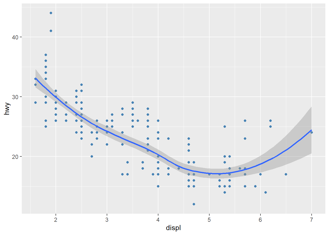
geom_smooth()also allows for a linear regression line.
ggplot(mpg, mapping = aes(x = displ, y = hwy)) +
  geom_point(color = 'steelblue') +
  geom_smooth(method = 'lm')
`geom_smooth()` using formula = 'y ~ x'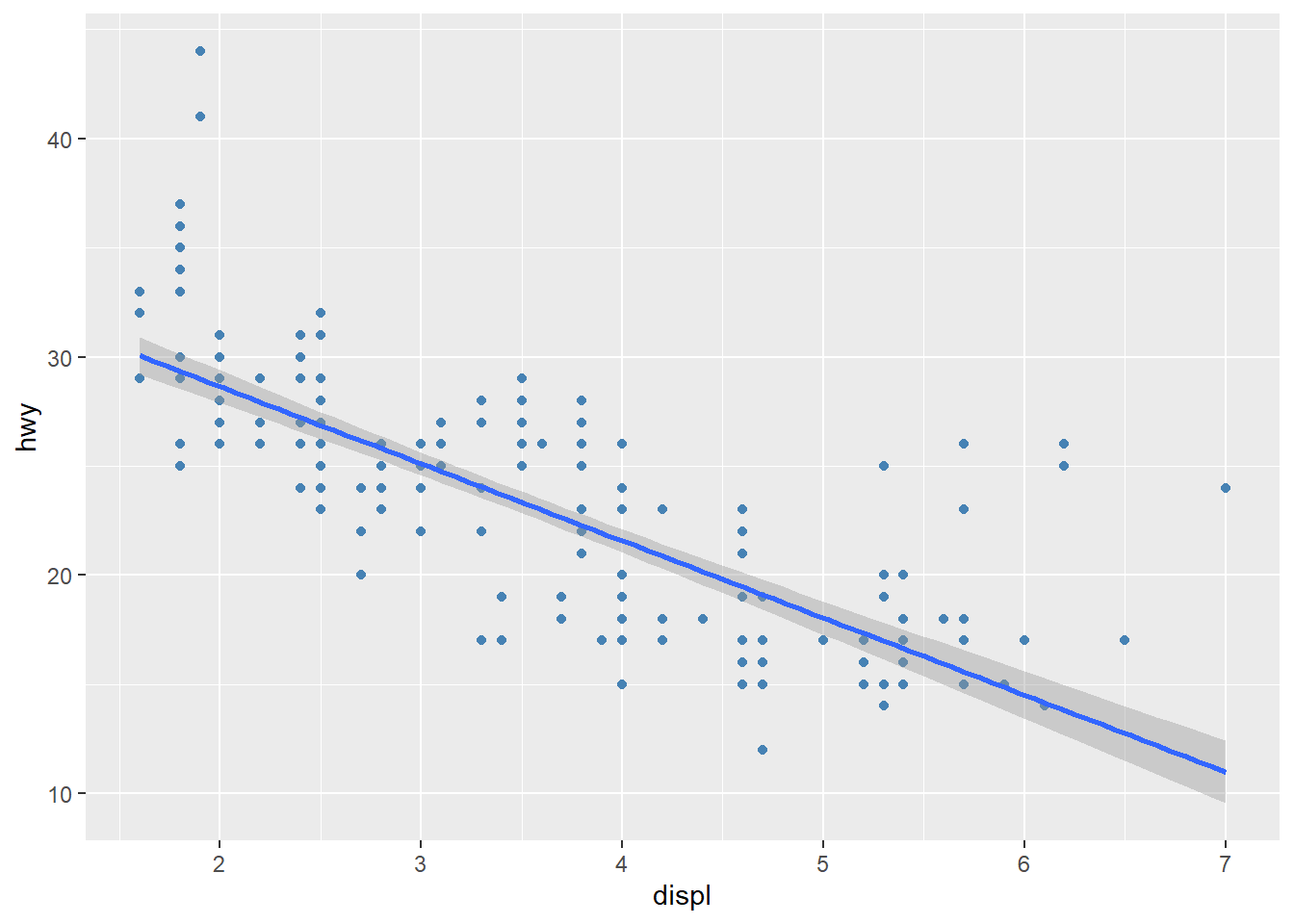
- Mapping aesthetics is powerful for visualizing the relationship between multiple variables.
ggplot(mpg, mapping = aes(x = displ, y = hwy, color = drv)) +
  geom_point()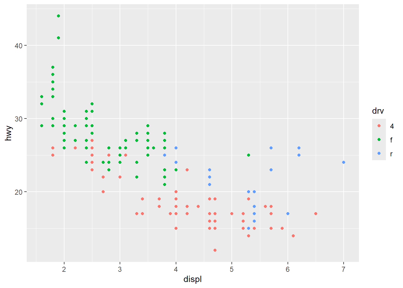
- Mapping aesthetics allows us to represent categories with different colors and shapes.
ggplot(mpg, mapping = aes(x = displ, y = hwy, color = drv, shape = drv)) +
  geom_point()
- Adding a theme can make the plot look better.
ggplot(mpg, mapping = aes(x = displ, y = hwy, color = drv, shape = drv)) +
  geom_point() +
  theme_bw()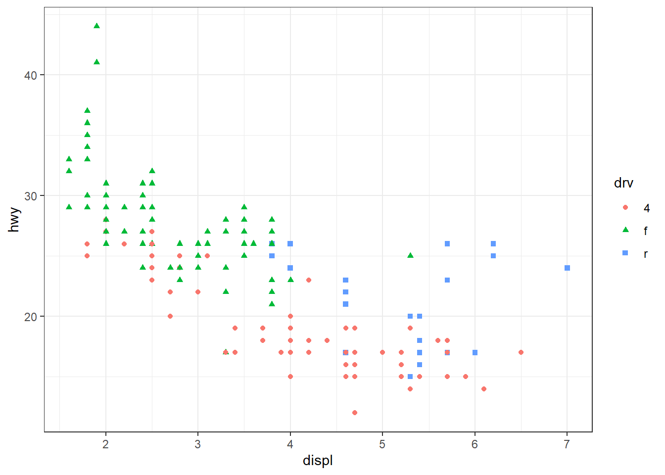
- Adding labels makes the plot more descriptive.
ggplot(mpg, mapping = aes(x = displ, y = hwy, color = drv, shape = drv)) +
  geom_point() +
  theme_bw() +
  labs(x = 'Engine Displacement',
       y = 'Highway Miles per Gallon',
       color = 'Drive Train',
       shape = 'Drive Train')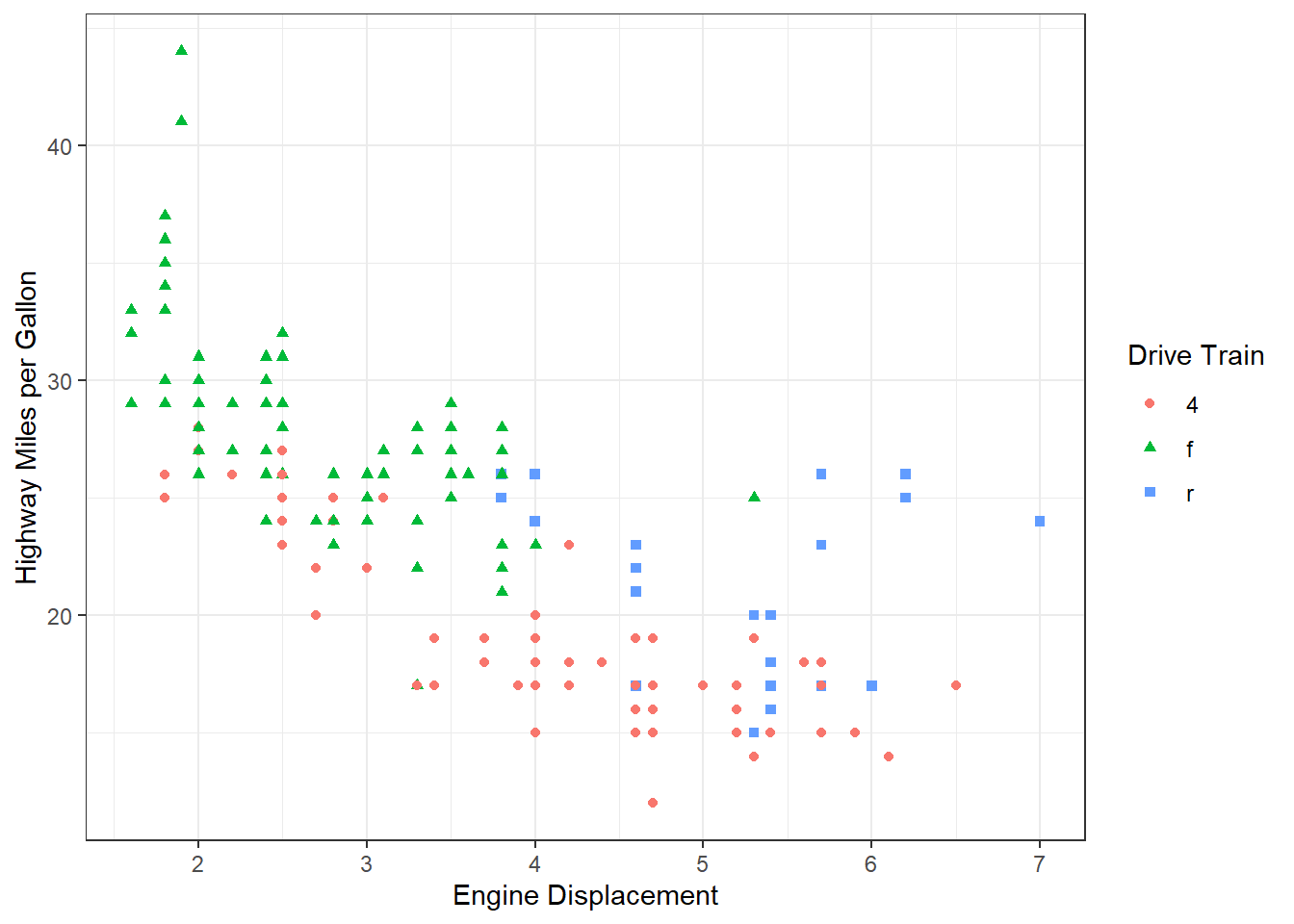
- Faceting divides the data into subsets according to a categorical variable and visualize each subset.
ggplot(mpg, mapping = aes(x = displ, y = hwy, color = drv, shape = drv)) +
  geom_point() +
  facet_wrap(~ drv) +
  theme_bw() +
  labs(x = 'Engine Displacement',
       y = 'Highway Miles per Gallon',
       color = 'Drive Train',
       shape = 'Drive Train')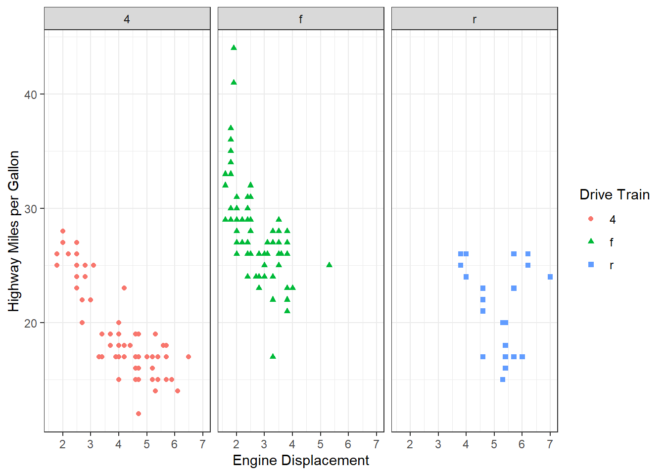
💻 Hands-On
Reproduce the following scatter plot:

Answer
ggplot(mpg, mapping = aes(x = displ, y = hwy, color = class)) +
  geom_point() +
  facet_wrap(~ class) +
  theme_bw() +
  labs(x = 'Engine Displacement',
       y = 'Highway Miles per Gallon',
       color = 'Type of Car',
       shape = 'Type of Car')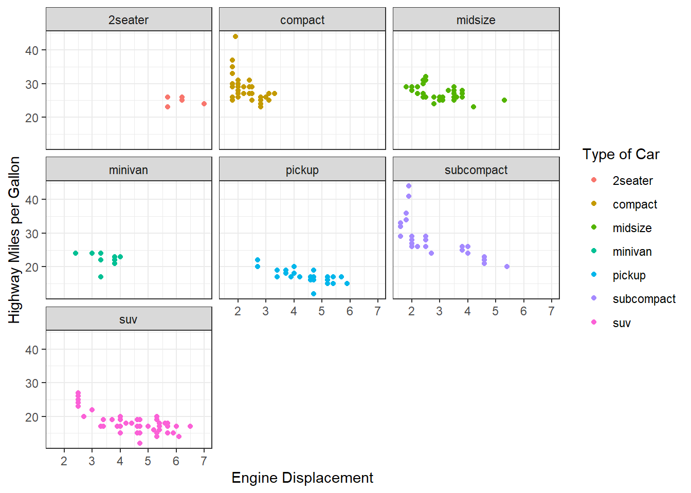
Bar plot geom_bar()
- Vertical bar plot can be made with
geom_bar()
ggplot(mpg, mapping = aes(x = drv)) +
  geom_bar()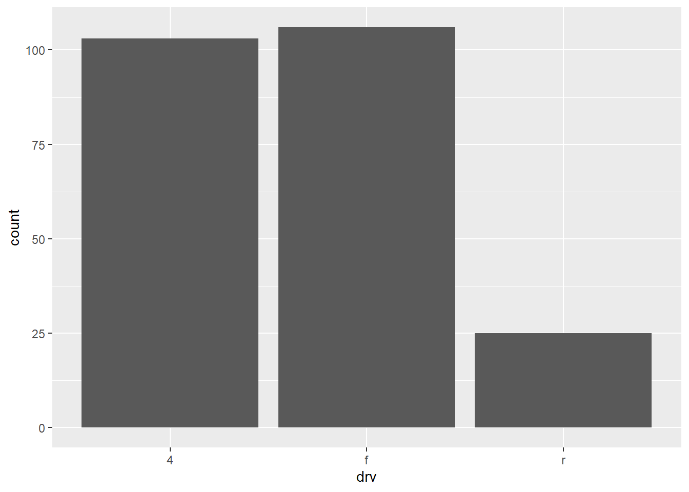
- Changing the mapping can create horizontal bar plot.
ggplot(mpg, mapping = aes(y = drv)) +
  geom_bar()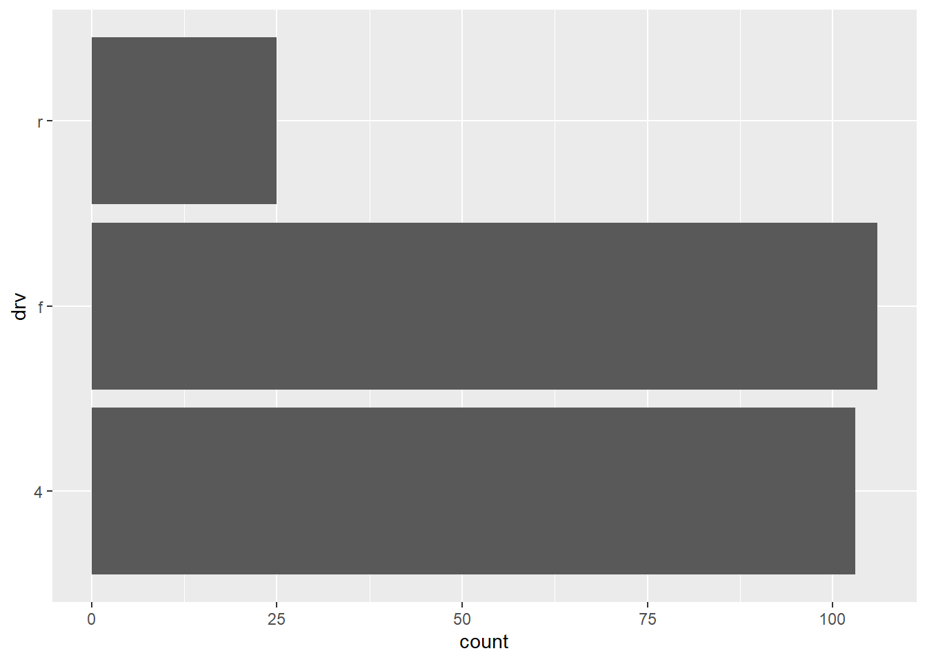
- Unlike
geom_point(), color is adjusted withfillrather thancolor.
ggplot(mpg, mapping = aes(x = drv)) +
  geom_bar(fill = 'tomato')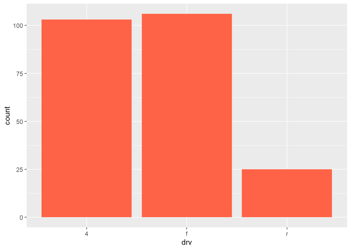
- Stacked bar plot can be obtained as follows:
ggplot(mpg, mapping = aes(x = drv, fill = class)) +
  geom_bar()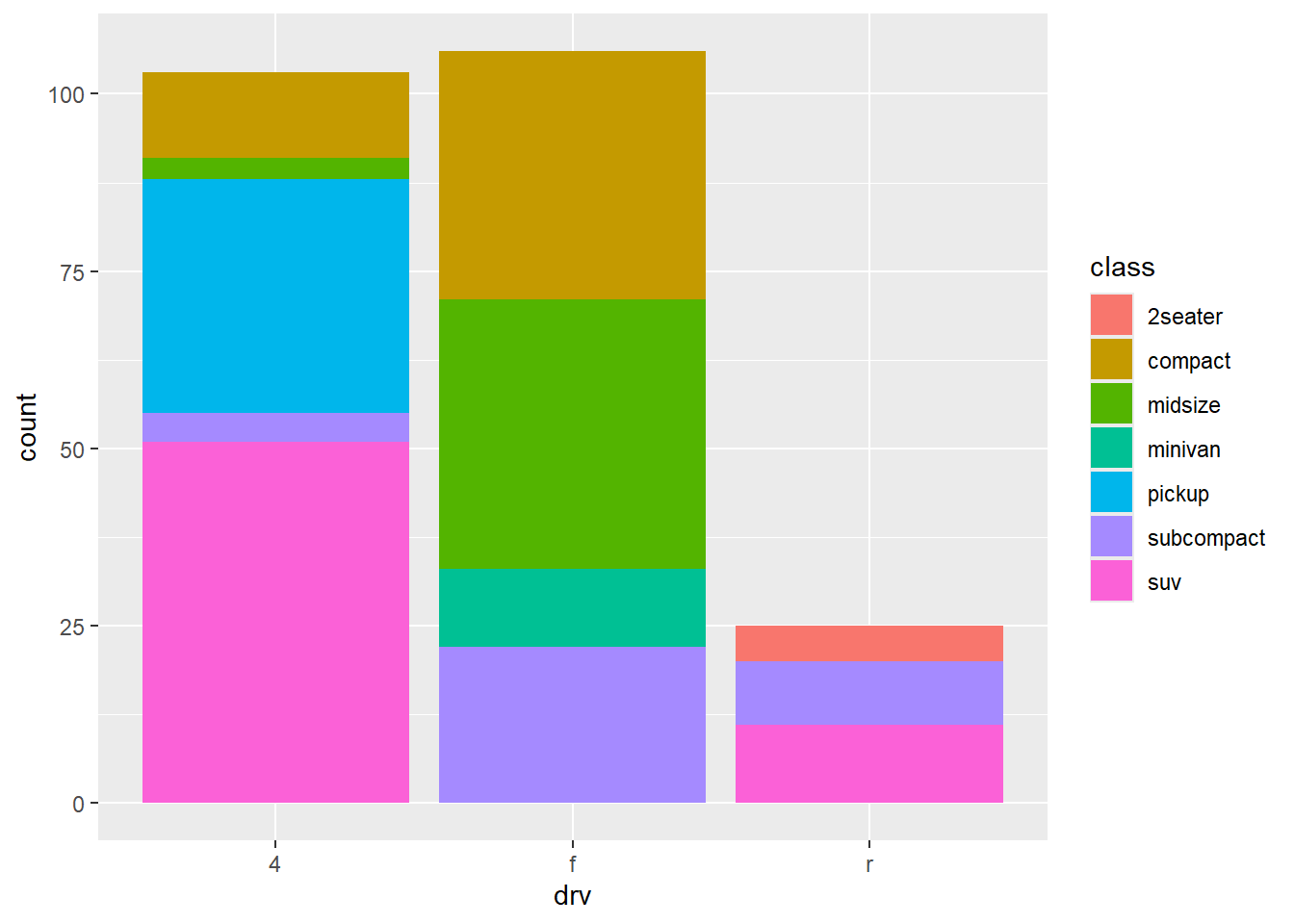
- Side-by-side bar plot can be obtained as follows:
ggplot(mpg, mapping = aes(x = drv, fill = class)) +
  geom_bar(position = 'dodge')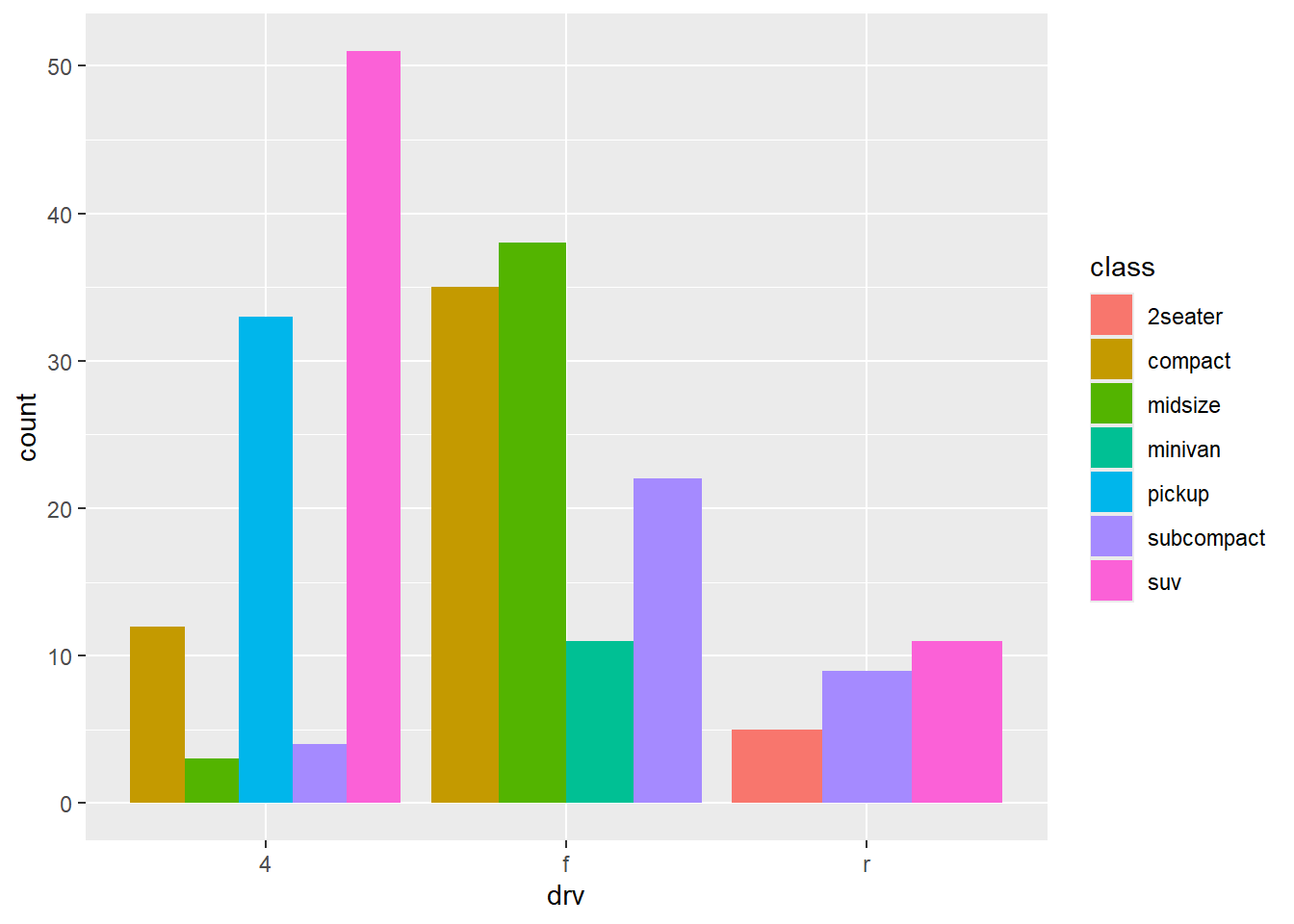
- Sequential, diverging and qualitative color scales from ColorBrewer can improve the bar plots.
ggplot(mpg, mapping = aes(x = drv, fill = class)) +
  geom_bar(position = 'dodge') +
  scale_fill_brewer(palette = 'Set1')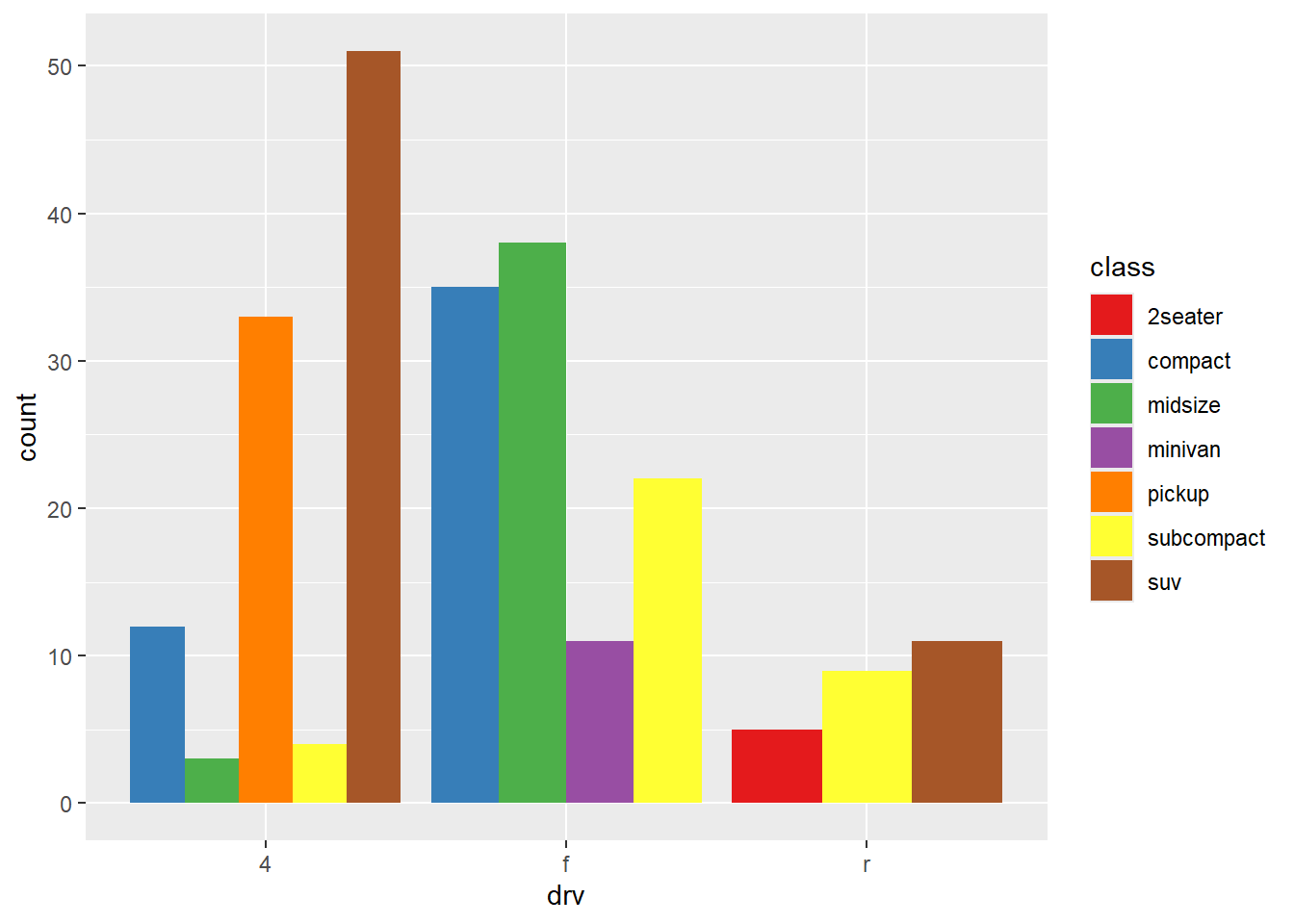
ggplot(mpg, mapping = aes(x = drv, fill = class)) +
  geom_bar(position = 'dodge') +
  scale_fill_brewer(palette = 'Spectral')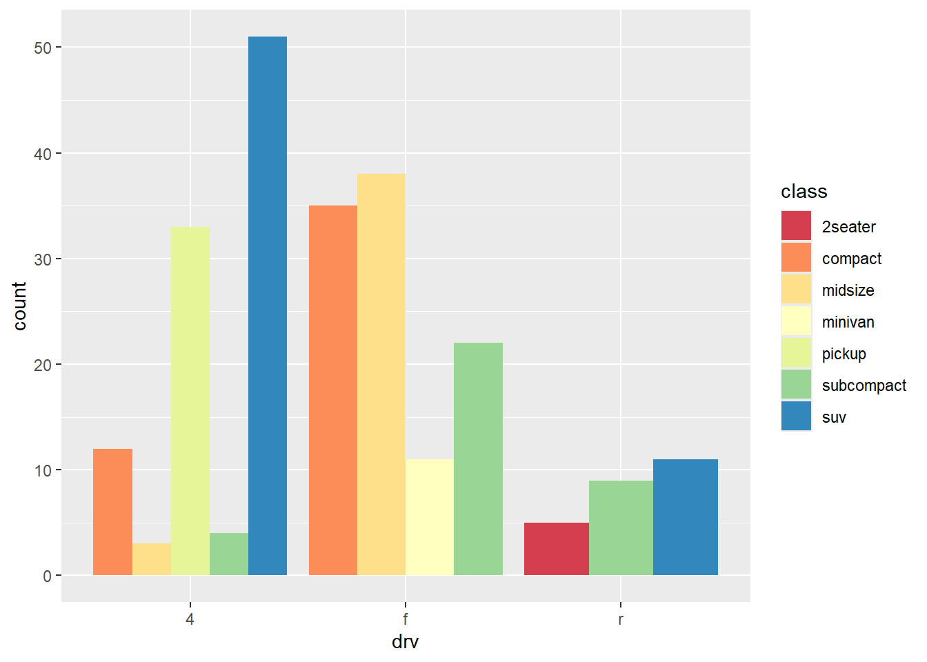
ggplot(mpg, mapping = aes(x = drv, fill = class)) +
  geom_bar(position = 'dodge') +
  scale_fill_brewer(palette = 'Pastel1')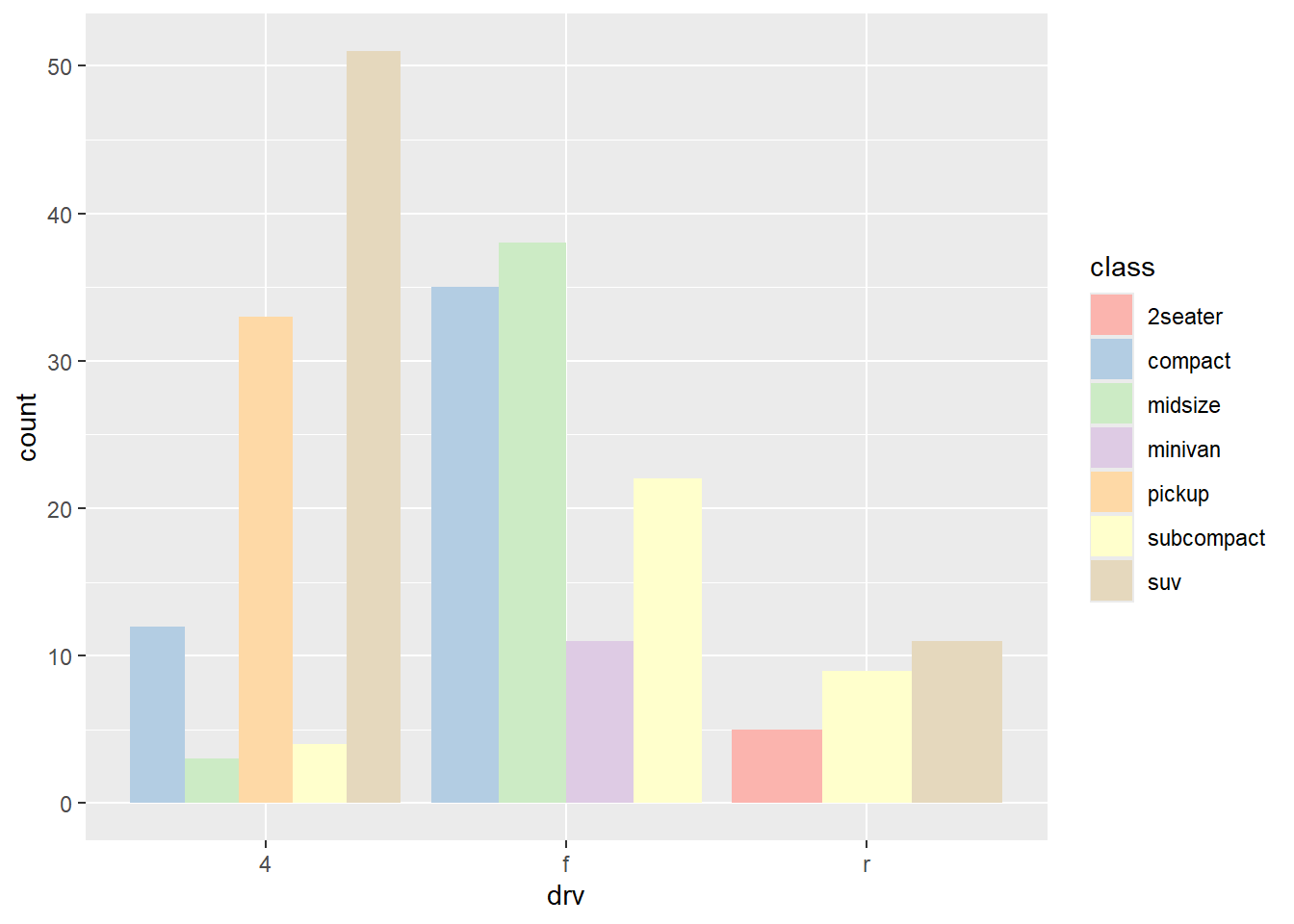
- Gray color scale is also available.
ggplot(mpg, mapping = aes(x = drv, fill = class)) +
  geom_bar(position = 'dodge') +
  scale_fill_grey()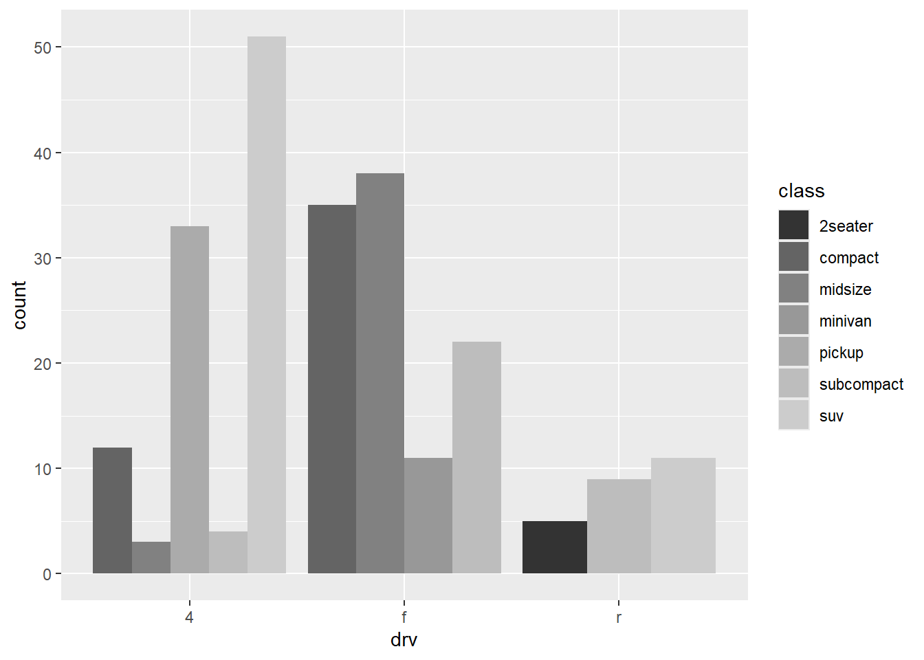
- One can also specify their own color scale. Refer to (https://colorbrewer2.org/#type=sequential&scheme=BuGn&n=3) for color scales that are colorblind safe, print friendly, and/or photocopy safe.
ggplot(mpg, mapping = aes(x = drv, fill = drv)) +
  geom_bar() +
  scale_fill_manual(values = c('#e5f5f9', '#99d8c9', '#2ca25f'))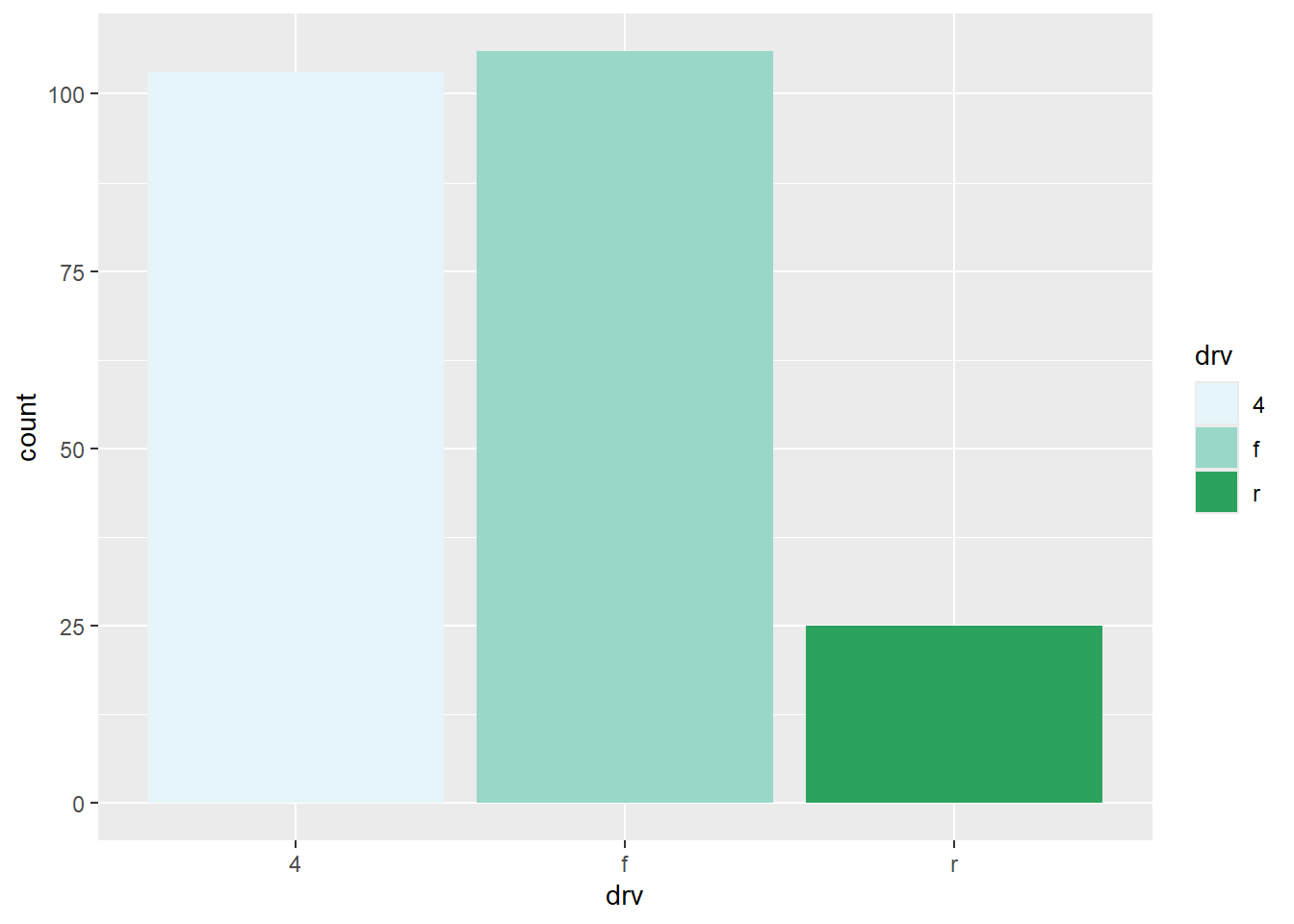
💻 Hands-On
Reproduce the following bar plot. Note that the color is burlywood2.

Answer
ggplot(mpg, mapping = aes(x = class)) +
  geom_bar(fill = 'burlywood2') +
  theme_bw() +
  labs(x = 'Drive Train',
       y = 'Frequency')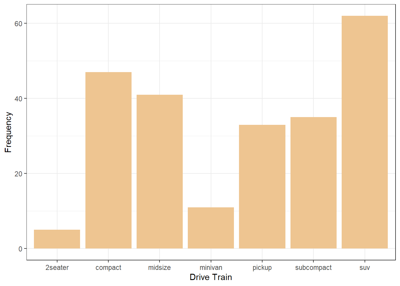
Histogram geom_histogram() and density curve geom_density()
- Histogram can be made with
geom_histogram().
ggplot(mpg, mapping = aes(x = hwy)) +
  geom_histogram(fill = 'chartreuse3')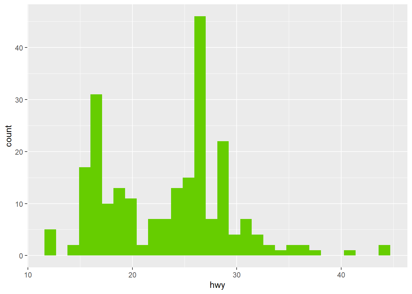
- Overlaying histograms can be used to compare different groups.
ggplot(mpg, mapping = aes(x = hwy, fill = drv)) +
  geom_histogram()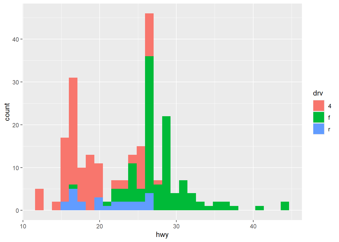
- However, it can be more informative to use faceting in the case of histogram.
ggplot(mpg, mapping = aes(x = hwy, fill = drv)) +
  geom_histogram() +
  facet_wrap(~ drv)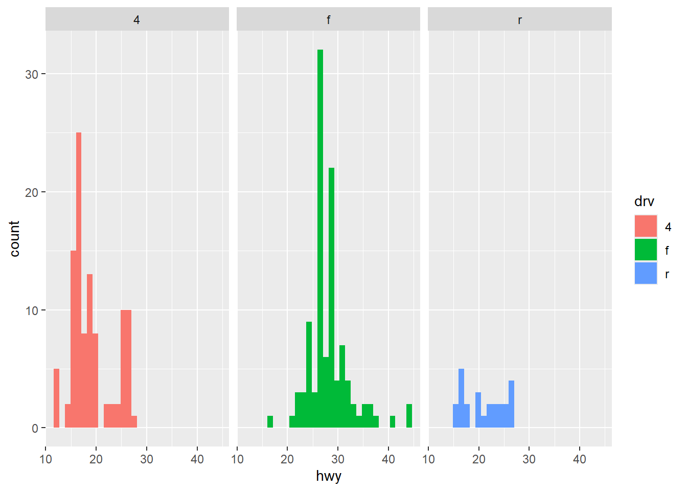
- Density is the “smoothed” version of histogram.
ggplot(mpg, mapping = aes(x = hwy)) +
  geom_density(fill = 'chartreuse3')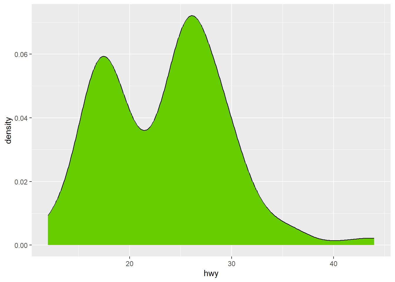
- Overlaying density curves are also possible to make.
ggplot(mpg, mapping = aes(x = hwy, fill = drv)) +
  geom_density()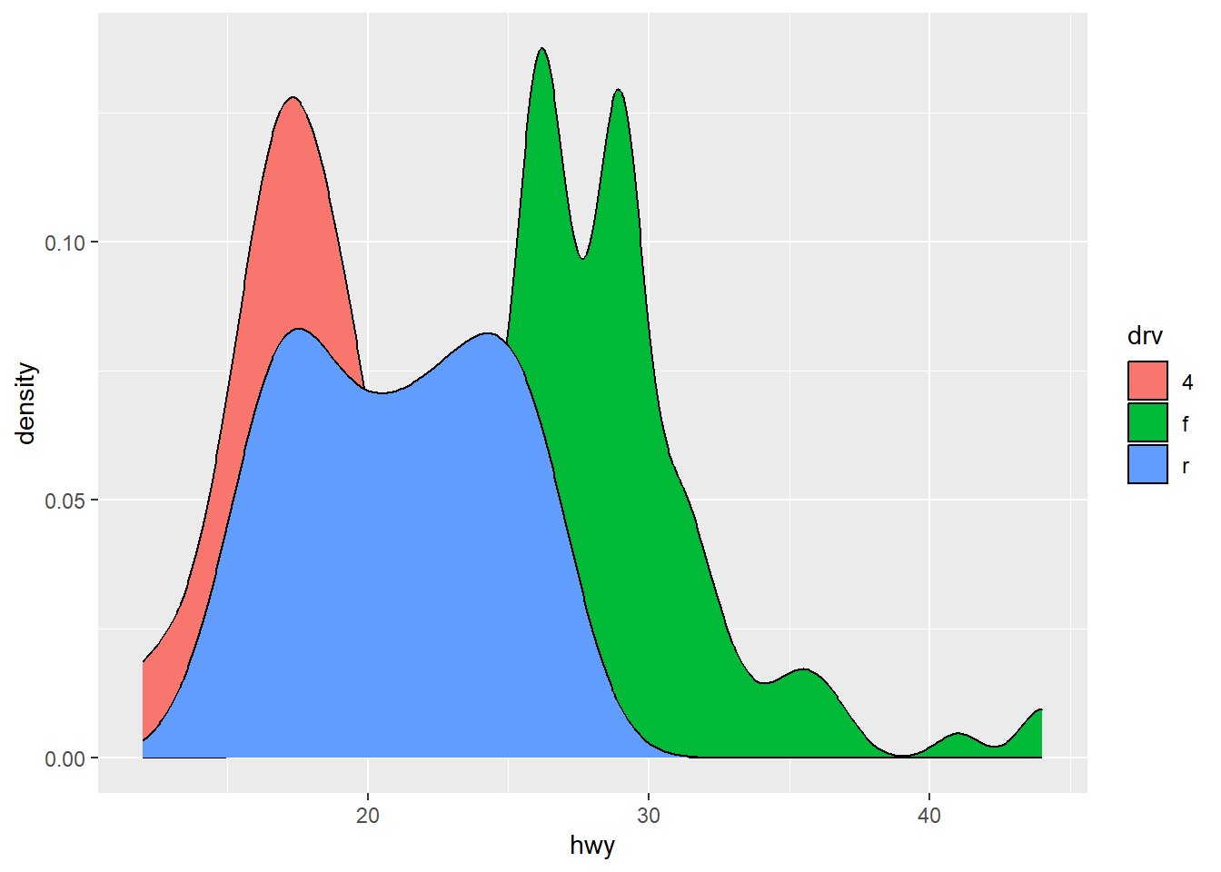
- If we prefer non-overlapping density curves, we can consider faceting.
ggplot(mpg, mapping = aes(x = hwy, fill = drv)) +
  geom_density() +
  facet_wrap(~ drv)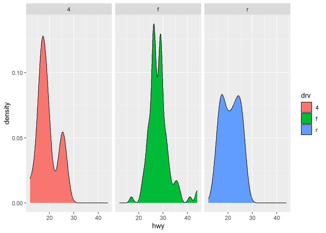
💻 Hands-On
Reproduce the following histogram:

Answer
ggplot(mpg, mapping = aes(x = hwy, fill = class)) +
  geom_histogram() +
  facet_wrap(~ class) +
  theme_bw() +
  labs(x = 'Highway Miles per Gallon',
       y = 'Frequency',
       fill = 'Type of Car')
`stat_bin()` using `bins = 30`. Pick better value with `binwidth`.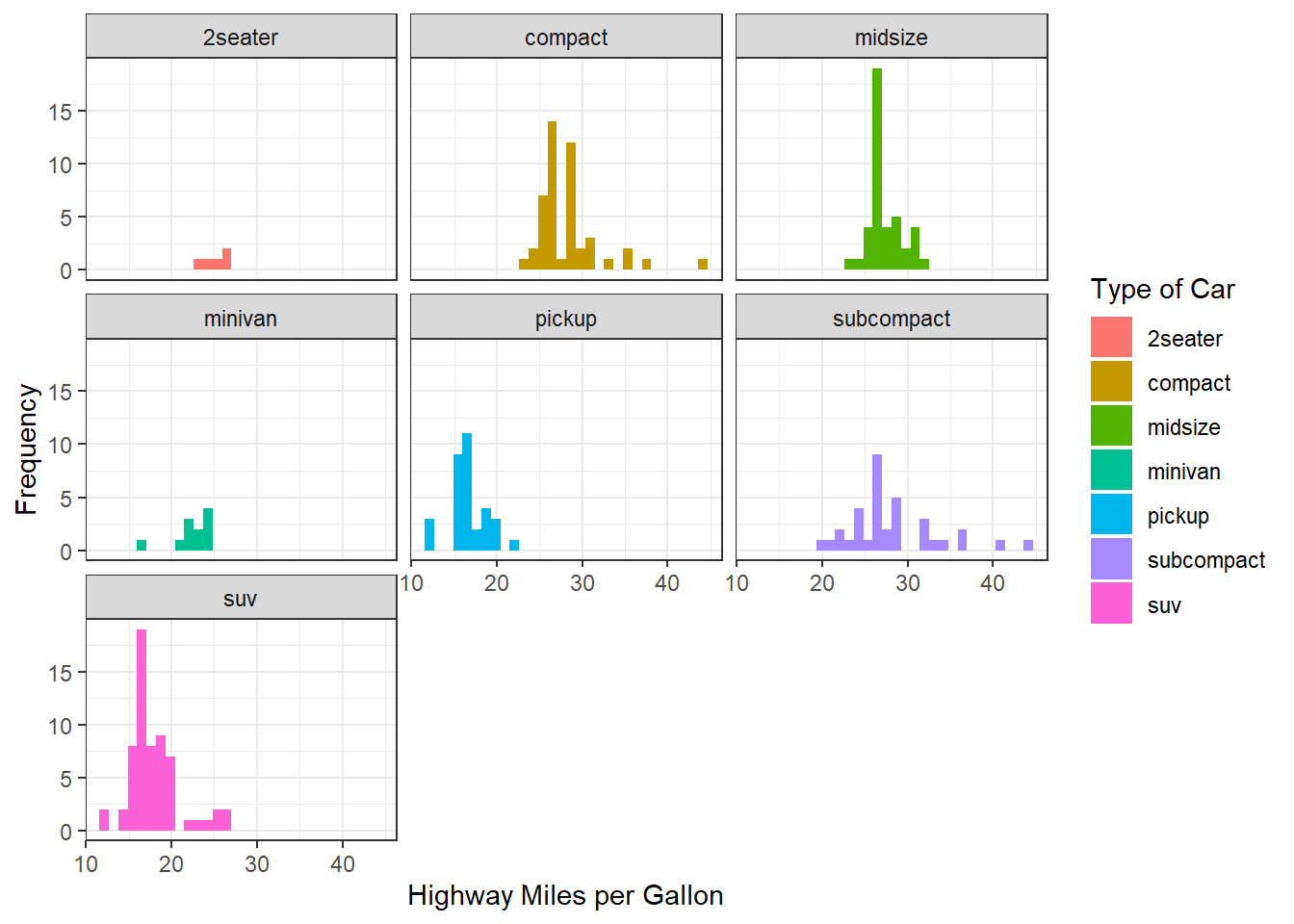
Box plot geom_boxplot() and violin plot geom_violin()
- Box plot can be made with
geom_boxplot().
ggplot(mpg, mapping = aes(y = hwy)) +
  geom_boxplot(fill = 'gold')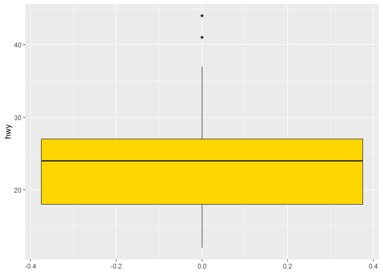
- Side-by-side box plots can be made using mapping.
ggplot(mpg, mapping = aes(y = hwy, fill = drv)) +
  geom_boxplot()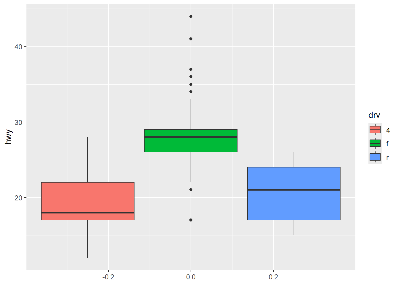
- A violin plot is a good combination of histogram and box plot.
ggplot(mpg, mapping = aes(y = hwy, x = drv, fill = drv)) +
  geom_violin()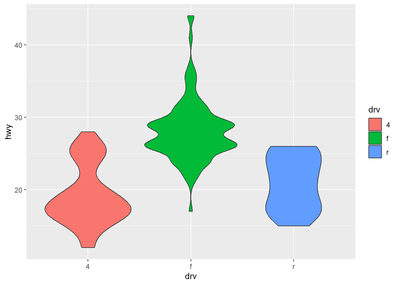
💻 Hands-On
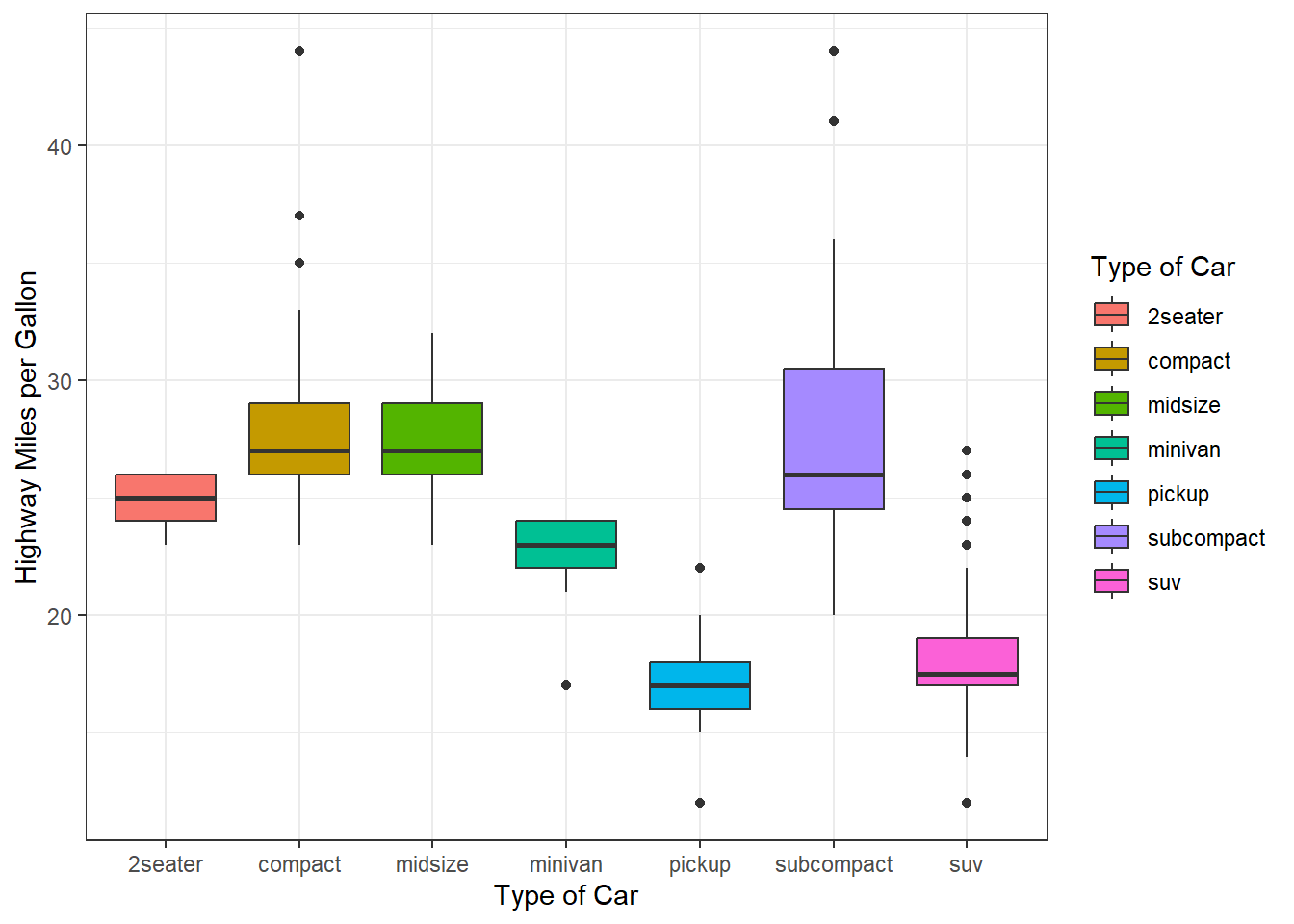
Reproduce the following box plots:

Answer
ggplot(mpg, mapping = aes(y = hwy, x = class, fill = class)) +
  geom_boxplot() +
  theme_bw() +
  labs(y = 'Highway Miles per Gallon',
       x = 'Type of Car',
       fill = 'Type of Car')