load(url('https://github.com/hungtong/DS-01-101/raw/refs/heads/main/dataset/l4a_data.rdata'))
load(url('https://github.com/hungtong/DS-01-101/raw/refs/heads/main/dataset/cdc.rdata'))4A: Examining Categorical Variables
Data Sets
Topics
Basic variable types
Frequency distribution, mode, and bar plot
Stacked and side-by-side bar plot
Basic variable types
- Data are commonly organized into a data matrix. In this format, each row is an observation and each column is a variable or feature.

- Roughly speaking, a variable can be numerical or categorical.

A numerical variable represents numbers that are meaningful to add, subtract, or take averages.
A categorical variable refers to specific categories that describe a characteristic.
Examining a categorical variable
- A frequency distribution is a tabular summary of data showing the number (frequency) of observations in each categories.

The mode is the category that appears the most. There can be multiple modes.
A bar plot visualizes the frequency distribution of a categorical variable using bars of different heights.
Examining two categorical variables
- A contingency table is a tabular summary of data for two categorical variables showing the frequency of their shared characteristics.

- Stacked bar plot can be used to visualize the contingency table.

- Side-by-side bar plot is also a good option.

Obtaining frequency distribution and bar plot in R
Frequency distribution for a categorical variable can be obtained using the
table()function.Bar plot can be generated using the
barplot()function. Horizontal or vertical bars can be made by adjustinghoriz = TRUE.Common graphical parameters in base R plotting include:
col- add color to the plotmain- main title labelxlab- label for x-axisylab- label for y-axisxlim- x-axis rangeylim- y-axis rangecex.main- size of main titlecex.lab- size of axis labelscex.axis- size of tick labels
For predefined and hex-value colors, check out the following websites:
💻 Hands-On
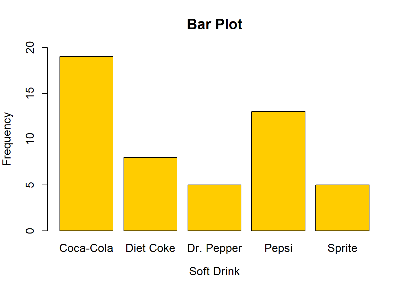
Obtain the frequency distribution and bar plot of the soft_drink data set.
Answer
To obtain the frequency distribution and bar plot of the soft_drink data set, we use the table() and barplot() functions.
freq <- table(soft_drink)
freq
soft_drink
Coca-Cola Diet Coke Dr. Pepper Pepsi Sprite
19 8 5 13 5 barplot(
freq,
col = "#FFCC00", # add color
main = "Bar Plot", # main title
xlab = "Soft Drink", # label for x-axis
ylab = "Frequency", # label for y-axis
cex.main = 1.5, # size of title
cex.lab = 1.2, # size of axis labels
cex.axis = 1.2, # size of tick labels
cex.names = 1.2, # size of categories
ylim = c(0, 20) # y-axis range
)
💻 Hands-On
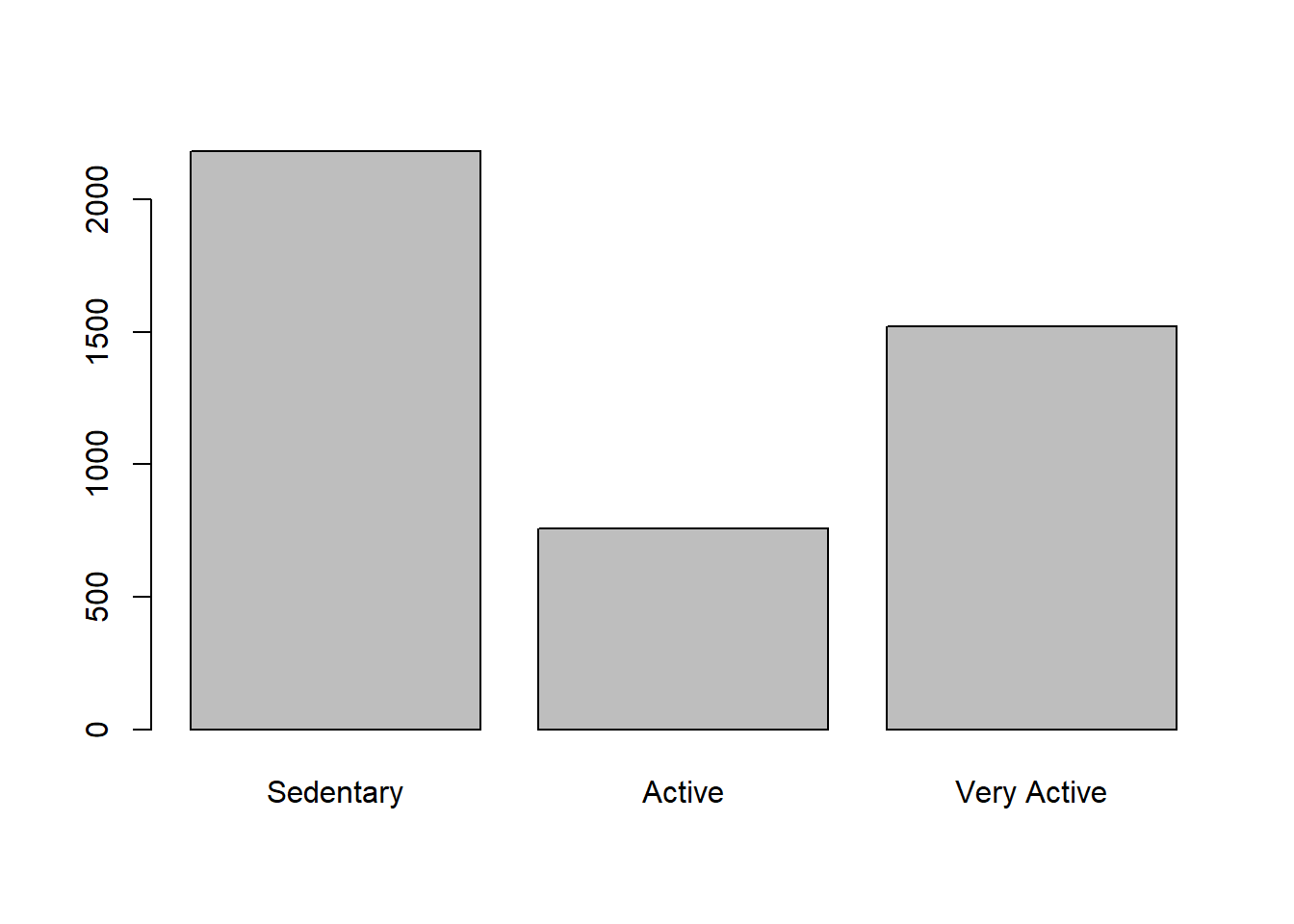
Try the following code and describe the difference between the two methods of generating a bar plot for the activity data set.
freq <- table(activity)

# Method 1
barplot(freq)

# Method 2
barplot(
  c(2183, 757, 1520),
  names.arg = c('Sedentary', 'Active', 'Very Active')
)
Answer
Note the frequency distribution of the activity data set.
freq <- table(activity)
freq
activity
Active Sedentary Very Active
757 2183 1520 Using method 1, we obtain
# Method 1
barplot(freq)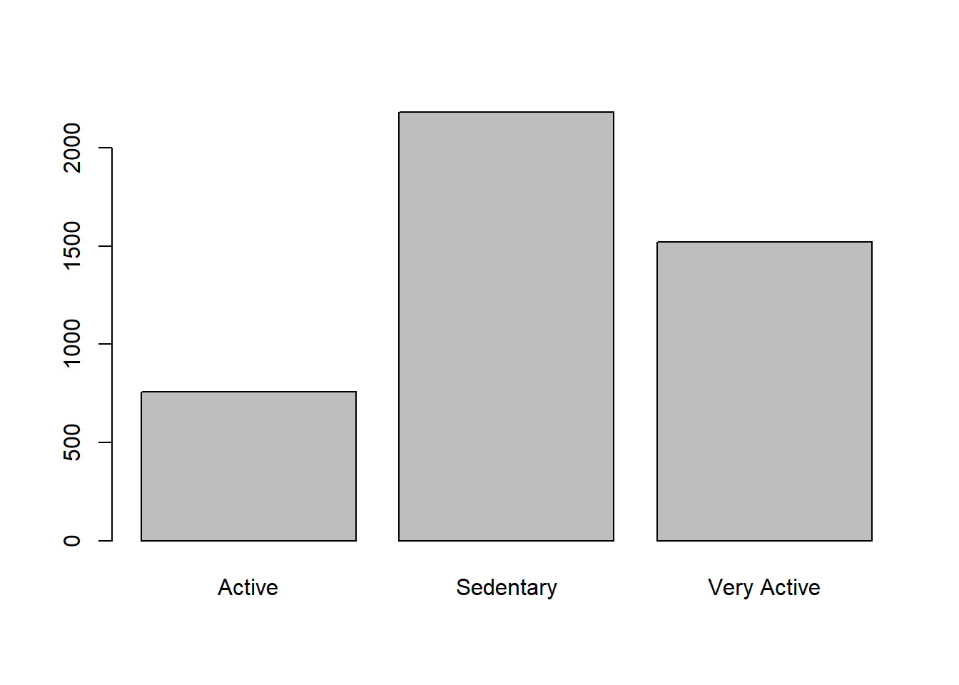
By default, table() and barplot() will arrange categories in the alphabetical order, which is not necessarily the natural order of ordinal categories. For ordinal categories, it is better than to manually rearrange the categories as in method 2.
# Method 2
barplot(
  c(2183, 757, 1520),
  names.arg = c('Sedentary', 'Active', 'Very Active')
) 
Stacked and side-by-side bar plot in R
For two categorical variables, the
table()function produces a contingency table.By default, stacked bar plot will be made. However, side-by-side bar plot can be made by setting
beside = TRUE.Setting
legend = TRUEand giving a vector of colors tocolwill help differentiate the categories.
💻 Hands-On
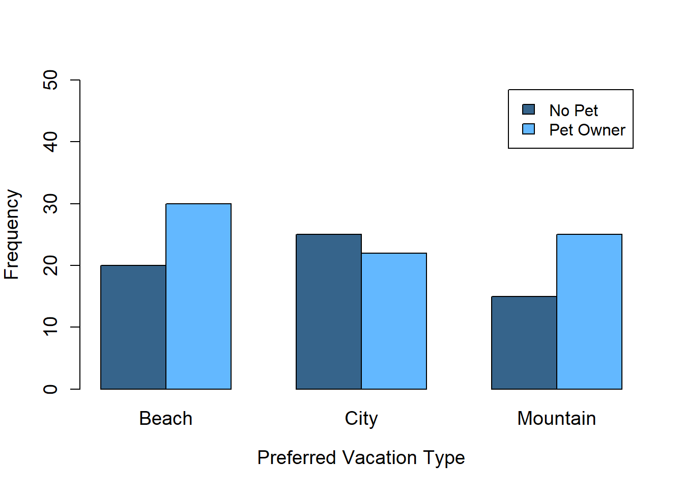
Obtain the contingency table and bar plot of the pet and vacation data set.
Answer
To obtain the contingency table and bar plot of the pet and vacation data set, we use the table() and barplot() functions.
conti_tab <- table(pet, vacation)
conti_tab
vacation
pet Beach City Mountain
No Pet 20 25 15
Pet Owner 30 22 25barplot(
conti_tab,
beside = TRUE,
legend = TRUE,
col = c("steelblue4", "steelblue1"),
xlab = "Preferred Vacation Type",
ylab = "Frequency",
cex.lab = 1.2,
cex.axis = 1.2,
cex.names = 1.2,
ylim = c(0, 50)
)
Behavioral survey from the Centers for Disease Control and Prevention (CDC)
The data set is slightly modified from OpenIntro,
The Behavioral Risk Factor Surveillance System (BRFSS) is an annual telephone survey of 350,000 people in the United States collected by the Centers for Disease Control and Prevention (CDC). As its name implies, the BRFSS is designed to identify risk factors in the adult population and report emerging health trends. For example, respondents are asked about their diet and weekly physical activity, their HIV/AIDS status, possible tobacco use, and even their level of healthcare coverage. The BRFSS Web site contains a complete description of the survey, the questions that were asked and even research results that have been derived from the data.
This data set is a random sample of 20,000 people from the BRFSS survey conducted in 2000. While there are over 200 questions or variables in this dataset, this data set only includes 9 variables.
The data set has the following variables:
genhlth- General health, with categories Excellent, Very Good, Good, Fair, and Poorexerany- Whether the respondent exercised in the past monthhlthplan- Whether respondent has some form of health coveragesmoke100- Whether respondent has smoked at least 100 cigarettes in their entire lifeheight- Respondent’s height in inchesweight- Respondent’s weight in poundswtdesire- Respondent’s desired weight in poundsage- Respondent’s age in yearsgender- Respondent’s gender
💻 Hands-On
Retrieve the first few respondents, a vector of variable names, and the structure of the cdc data set.
Answer
The first few respondents are
head(cdc) genhlth exerany hlthplan smoke100 height weight wtdesire age gender
1 Good No Yes No 70 175 175 77 Male
2 Good No Yes Yes 64 125 115 33 Female
3 Good Yes Yes Yes 60 105 105 49 Female
4 Good Yes Yes No 66 132 124 42 Female
5 Very Good No Yes No 61 150 130 55 Female
6 Very Good Yes Yes No 64 114 114 55 FemaleA vector of variable names is
colnames(cdc) # names(cdc)[1] "genhlth" "exerany" "hlthplan" "smoke100" "height" "weight" "wtdesire"
[8] "age" "gender" The structure of the cdc data set is described as follows:
str(cdc)'data.frame': 20000 obs. of 9 variables:
$ genhlth : Factor w/ 5 levels "Excellent","Very Good",..: 3 3 3 3 2 2 2 2 3 3 ...
$ exerany : Factor w/ 2 levels "Yes","No": 2 2 1 1 2 1 1 2 2 1 ...
$ hlthplan: Factor w/ 2 levels "Yes","No": 1 1 1 1 1 1 1 1 1 1 ...
$ smoke100: Factor w/ 2 levels "Yes","No": 2 1 1 2 2 2 2 2 1 2 ...
$ height : num 70 64 60 66 61 64 71 67 65 70 ...
$ weight : int 175 125 105 132 150 114 194 170 150 180 ...
$ wtdesire: int 175 115 105 124 130 114 185 160 130 170 ...
$ age : int 77 33 49 42 55 55 31 45 27 44 ...
$ gender : Factor w/ 2 levels "Male","Female": 1 2 2 2 2 2 1 1 2 1 ...💻 Hands-On
How many respondents are there? How many variables? Identify the type of each variable.
Answer
The number of respondents is
nrow(cdc) [1] 20000The number of variables is
ncol(cdc)[1] 9A different way to explore the number of respondents and variables is
dim(cdc)[1] 20000 9In the data set, height, weight, wtdesire, and age are numerical, while the rest are categorical.
💻 Hands-On
Are there any missing values in the data set?
Answer
There are no missing values in the data set. Recall that the complete.cases() function gives a logical vector indicating which observations have no missing values.
sum(!complete.cases(cdc))[1] 0💻 Hands-On
Examine the general health of respondents using appropriate summary statistics and graphical displays.
Answer
genhlth represents the general health of respondents. This is an ordinal categorical variable with 5 levels. To summarize this variable, we can look at its frequency distribution and bar plot.
freq <- table(cdc$genhlth)
freq
Excellent Very Good      Good      Fair      Poor
4657 6972 5675 2019 677 barplot(freq, col = 'tomato', main = 'General Health')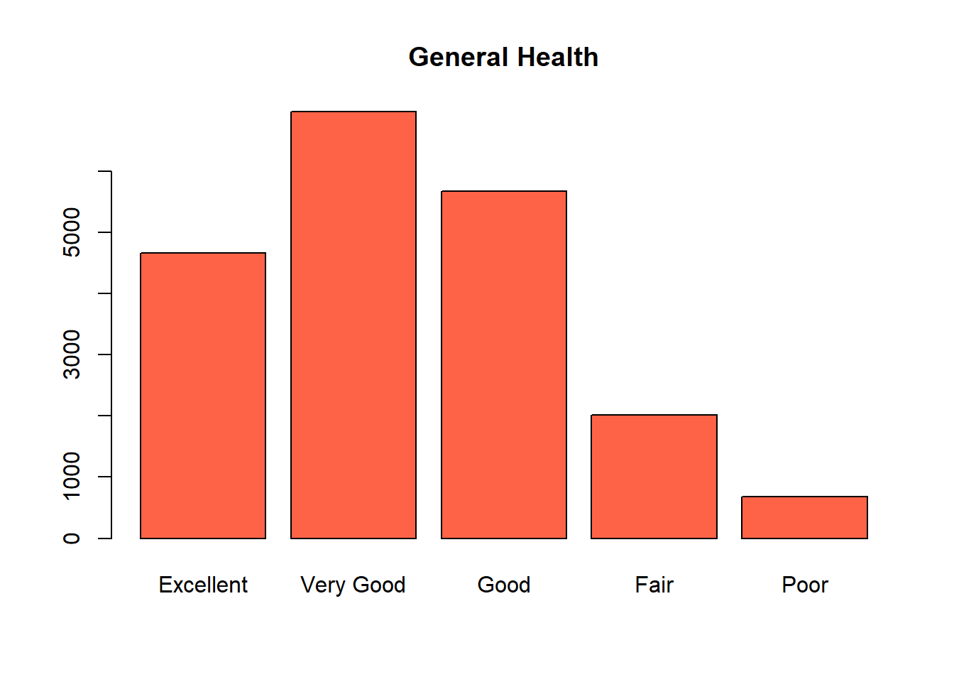
Most respondents have Very Good and Good health, which is a positive thing. Fair and Poor are much less common.
💻 Hands-On
Examine the number of respondents who have smoked 100 cigarettes in their lifetime using appropriate summary statistics and graphical displays.
Answer
smoke100 indicates respondents who respondents who have smoked 100 cigarettes in their lifetime. This is a nomial categorical variable with two levels.
freq <- table(cdc$smoke100)
freq
  Yes    No
9441 10559 barplot(freq, col = 'chartreuse3', main = 'Smoking Status')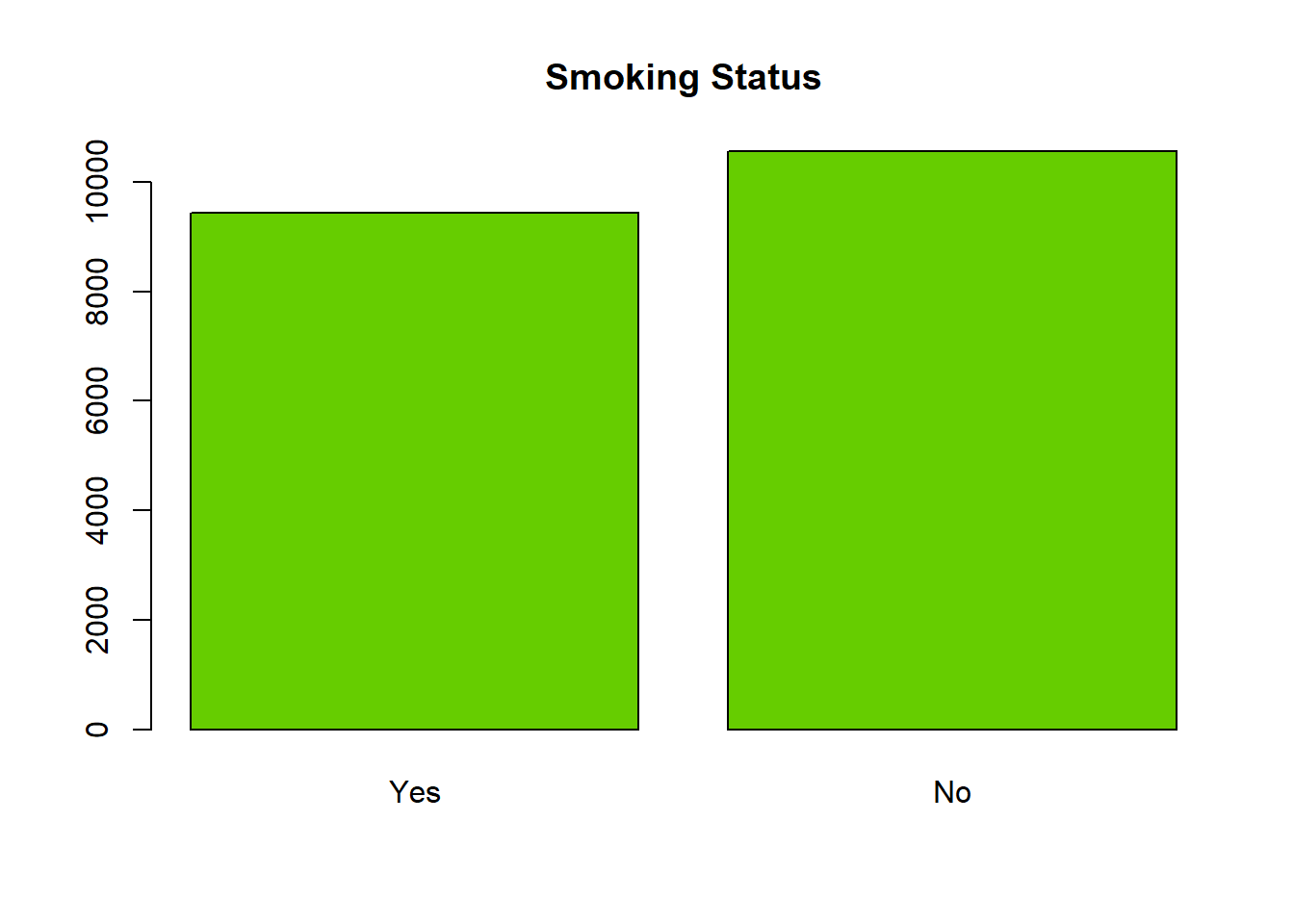
There are more non-smokers but the number of smokers is close to half of the data set.
💻 Hands-On
What is the relationship between smoking habits and general health?
Answer
To explore the relationship between two categorical variables, smoking habit smoke100 and general health genhlth, we can use contingency table and side-by-side bar plots.
conti_tab <- table(cdc$smoke100, cdc$genhlth)
conti_tab
      Excellent Very Good Good Fair Poor
  Yes      1778      3214 2893 1108  448
No 2879 3758 2782 911 229barplot(conti_tab, beside = TRUE, legend = TRUE,
col = c("aquamarine1", "cadetblue4"))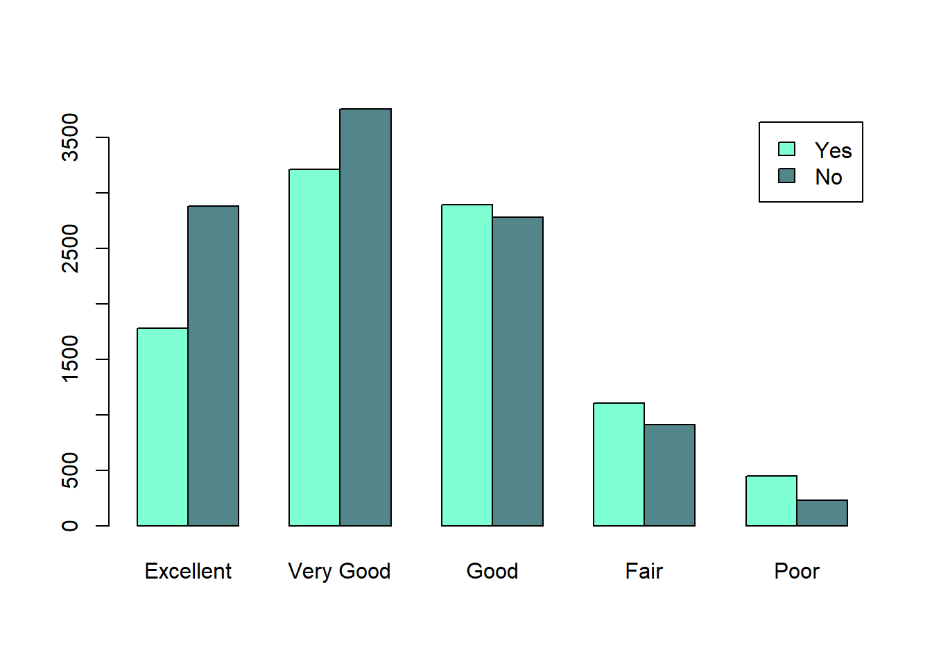
Respondents with Excellent and Very Good health tend to be non-smokers (especially Excellent), whereas respondents with Fair and Poor health tend to be smokers.